The opening title sequence for the Duffer brothers 2016 series Stranger Things (2016) looks, sounds and feels like a memory. Nostalgia is rooted in typeset and motion design. The past is described and categorised in colours, typefaces, sound and image. The nostalgic fantasy horror genre of the 1980s was defined by synth punk rock bands, Stephen king classics, and movies from David Cronenberg, Steven Spielberg and John Hughes.
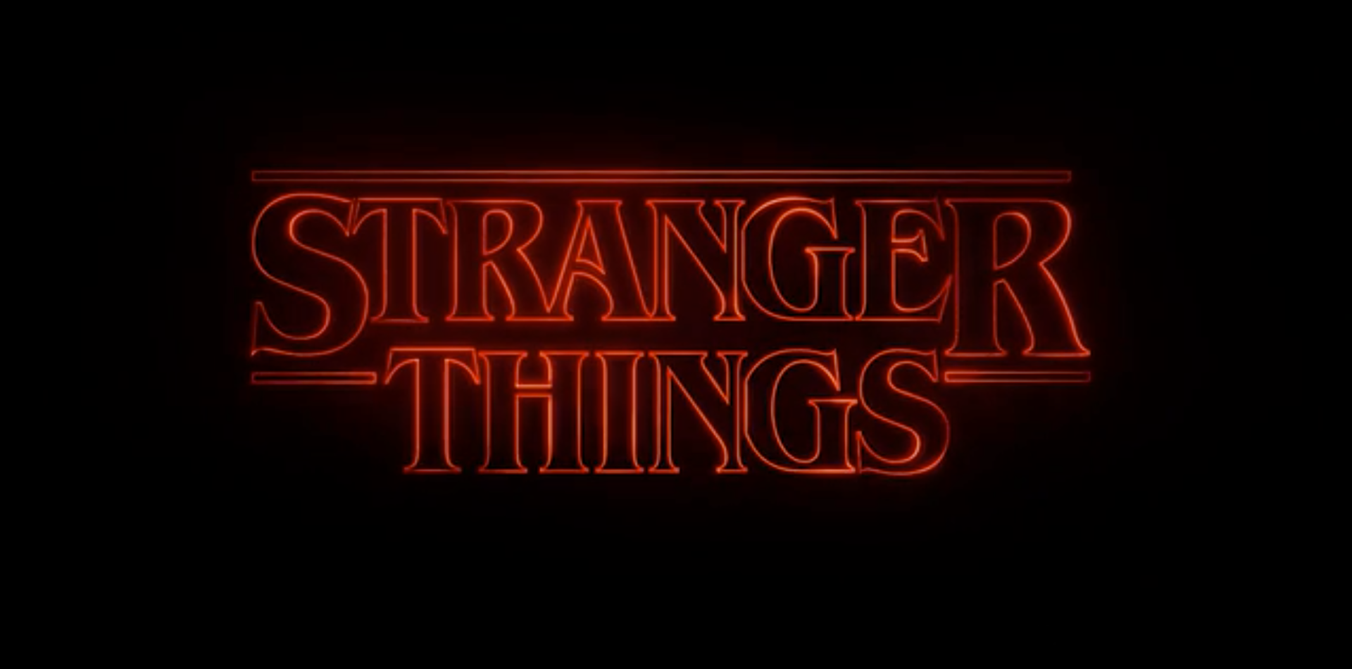
Stranger Things’ (2016) opening title sequence is purely typographic, created by Imaginary forces title design team. The primary object motion is the lettering, using the typeface Benguiat an outlined serif typeset, referencing its bold horror classic predecessors. The motion in Stranger Things is non-linear, each letter form following its own path toward the centre of the composition. The secondary motion studies the type in close ups slowly zooming further out from its original constricted focus of the anatomy of the letterforms before presenting the completed title in its glowing glory.
Immersive and playful, the title takes its time and teases the viewer with its sharp glowing red letterforms fading in and out of frame peaking interest before revealing the title itself in its final glowing red, ominous form. This stimulates and conditions the viewer for the narrative and experience ahead. The stark, bold thick letterhead insinuates doom and sharp chaos. The colours and use of light and shadow make an obvious and intriguing invitation to join in on the science fiction mystery “let the typeface set the mood” (Dougherty, 2016).
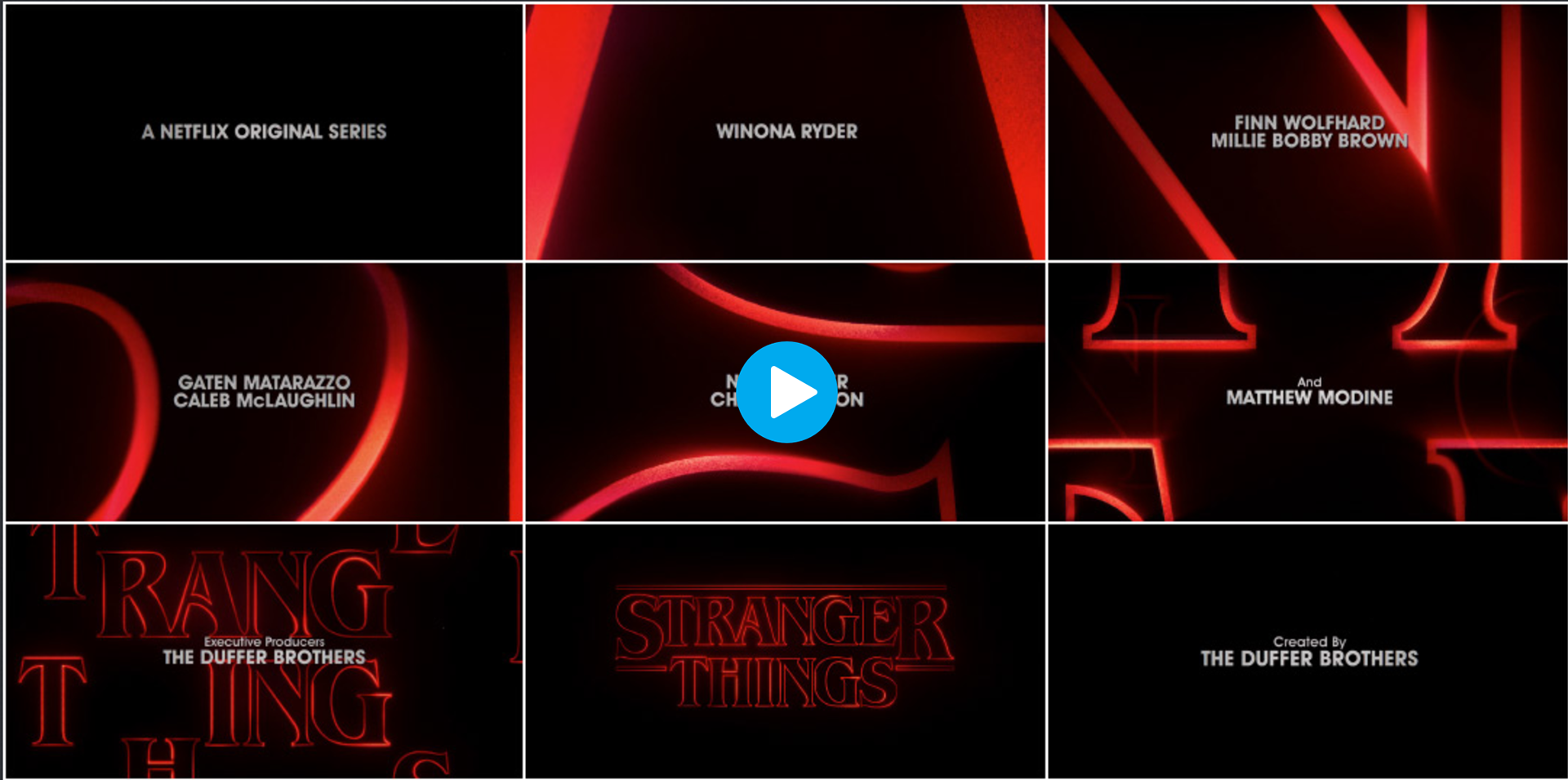
Stranger Things 2016, Film Still, Title Design: Imaginary Forces, Arisu Kashiwagi My Tran, Accessed March 18 <https://www.youtube.com/watch?v=-RcPZdihrp4>
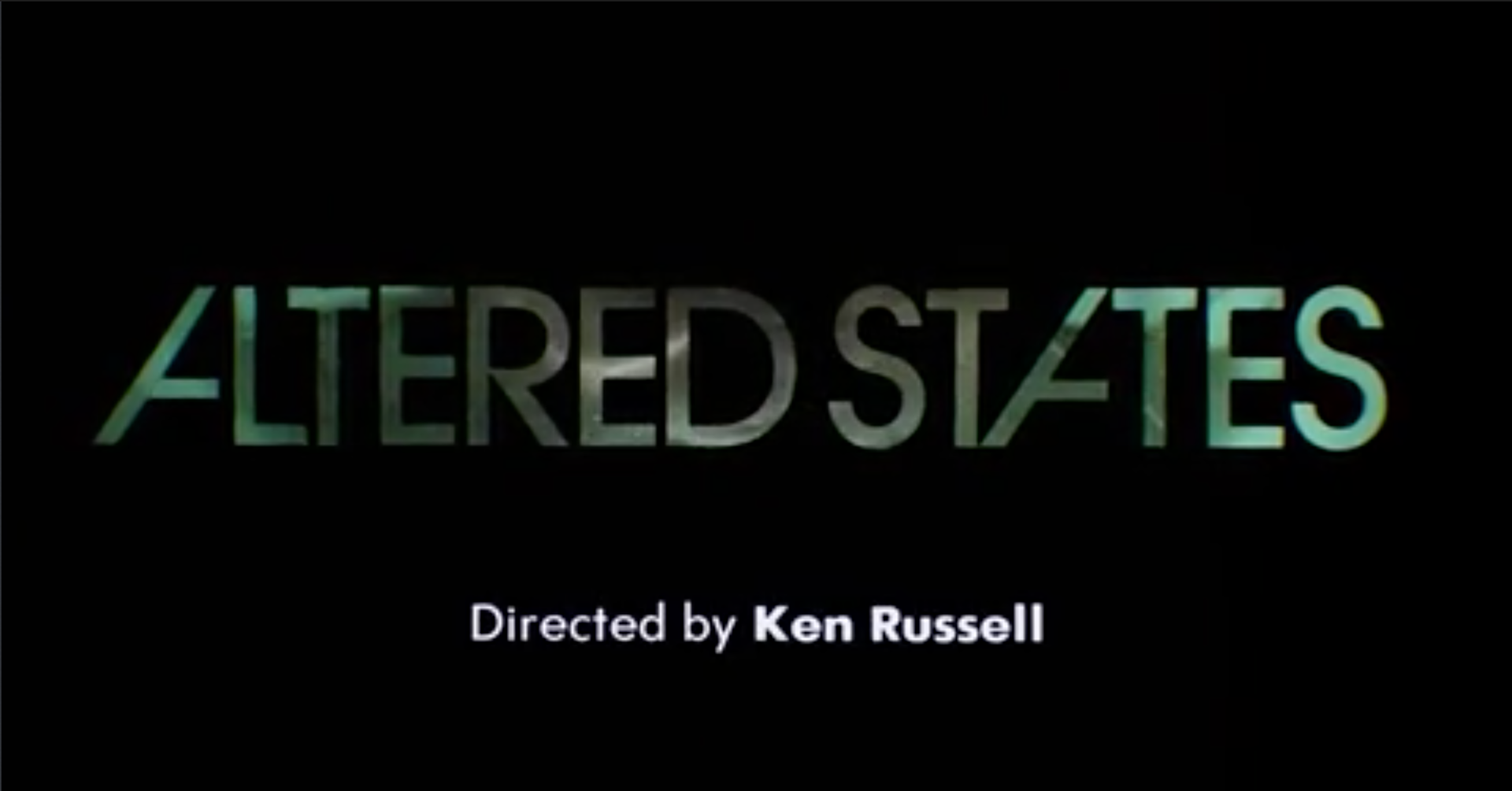
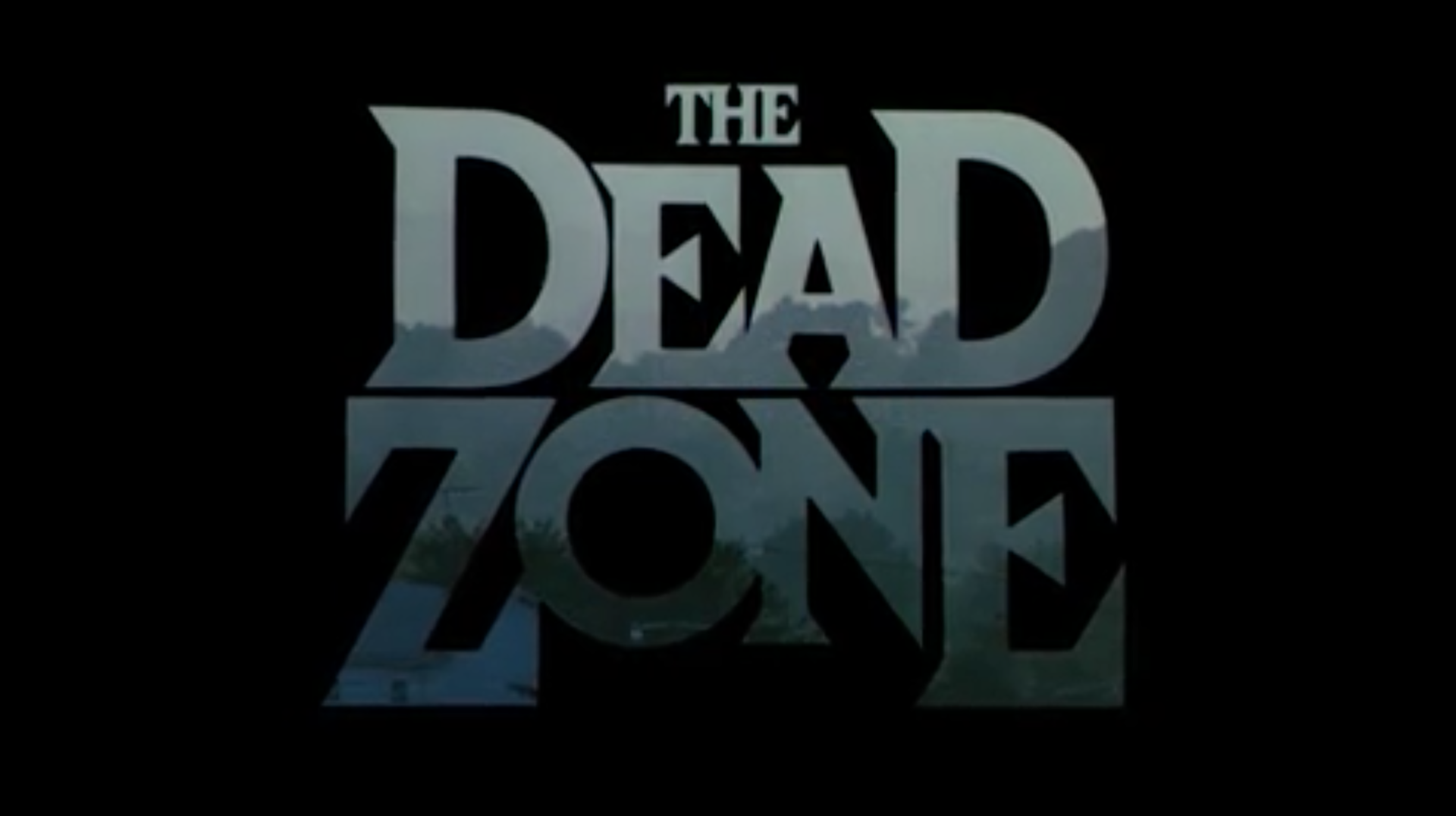
The opening title sequences for Altered States (1980) and The Dead Zone (1983) of the 1980s designed by Richard Greenberg were primary inspirations for imaginary forces title design team. Both title sequences use strong typefaces The Dead Zone (1983) “a disjointed version of Helvetica Black” and Altered States (1980) “a slightly modified ITC Avant Garde Gothic” Both make use of large staggered lettering that fill the screen in and out of frame revealing static photographs and moving video through the letter form.
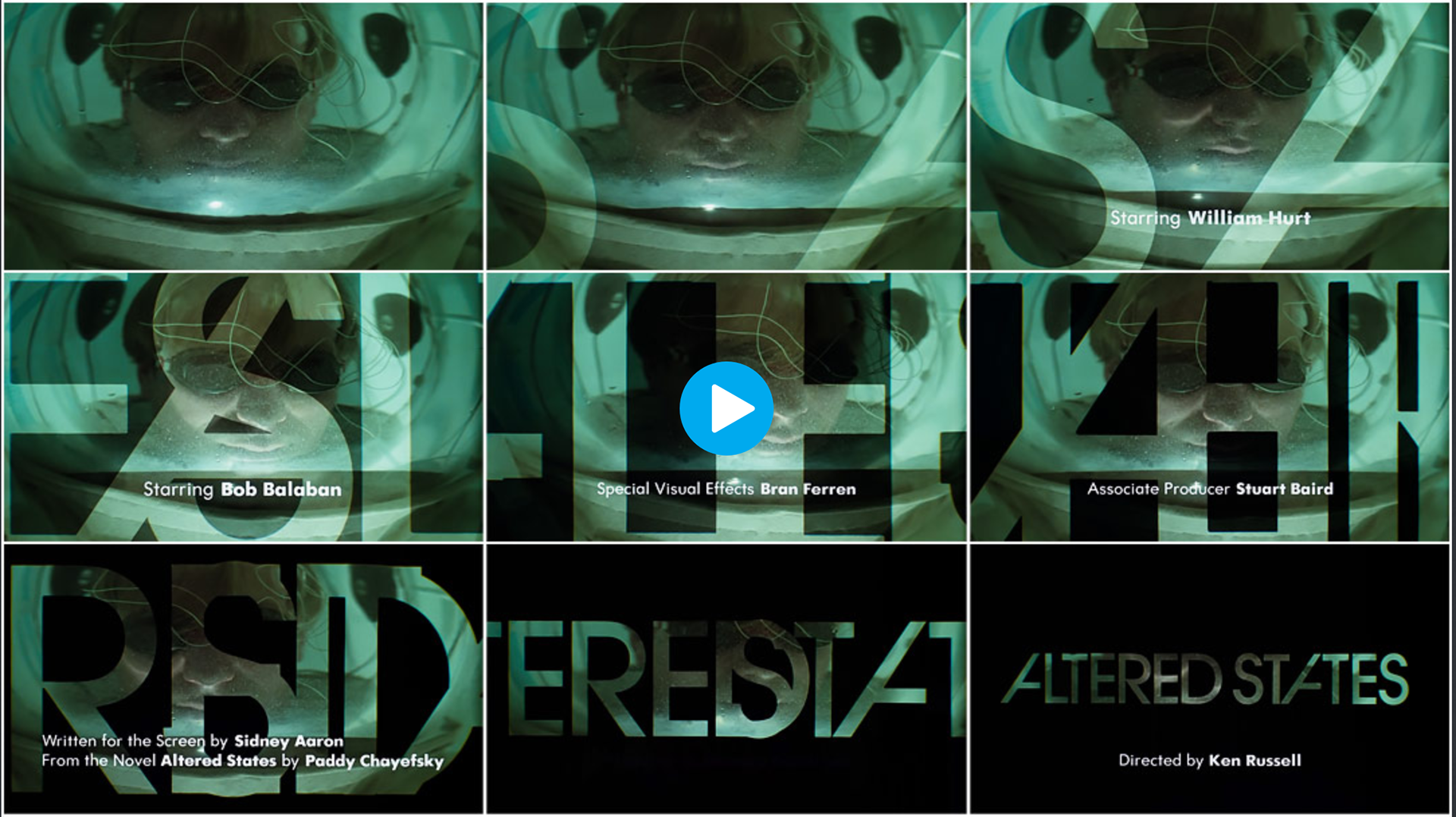
Altered States 1980, Film Still, Title Design: Richard Greenberg, Accessed March 18 <https://www.youtube.com/watch?v=esMg3eztc2s/>
Altered States (1980) opens with video footage. The title sequence letterforms filling the screen sequence shifting in with opaqueness to see the images underneath. The letter forms follow a uniform, non-linear path toward the centre before overlapping one another across the screen with the credits in a smaller white san serif fading in and out below. The title continues lopping in the same path and speed while the video begins to fade to black, staying only visible within the letter forms. Finally, the camera motion zooms out showing the letters locking into place and tittle being completely visible before fading into the opening scene.
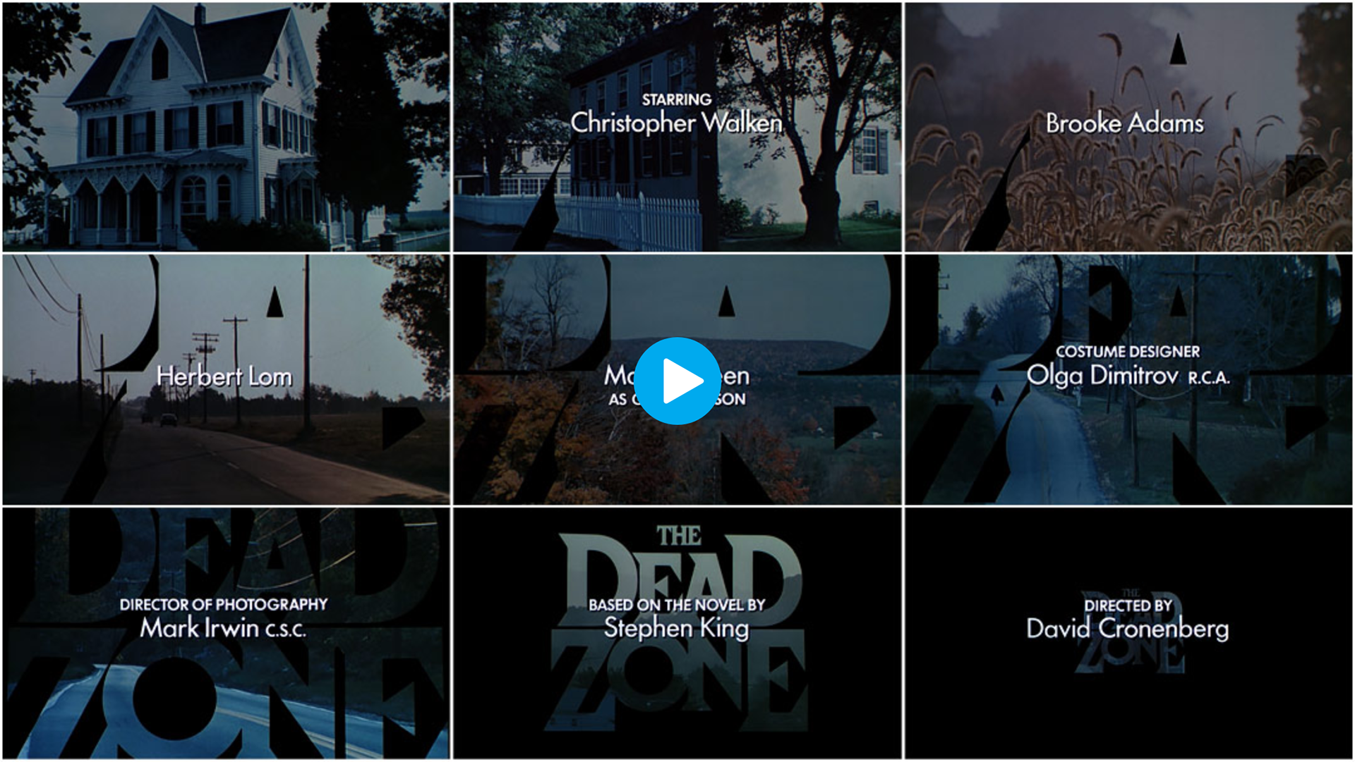
The Dead Zone 1983, Film Still, Title Design: Richard Greenberg, Accessed March 18 <youtube.com/watch?v=qa1DKluzSz4>
The Dead Zone (1983) title sequence opens with white san serif letterforms on a black background before opening on a series of fade in photography stills. Changing as the music intensifies, we see disjointed black pieces appear as photographs which are zoomed in cropped sections of the greater title. As time goes on the camera motion letter zooms outward in static fades from photo to photo and you can read the complete title rather than seeing obscure parts of the letter forms. The final image is the complete title zooming out in natural motion into a large black mass before fading to the beginning of the film.
Stranger Things (2016) follows suit, before landing on the episode title card, the camera motion reverses; zooming up close and through title cards fading quickly into the opening image of the scene, mirroring the image and type sequences of The Dead Zone and Altered States.
These title sequences explore variations of similar motion design principles. All create an atmosphere that represents the overarching narrative, making memorable sequences that thematically brand and promote the story they represent. (Krasner, 2013)
Sources:
- Krasner, J 2013, Motion Graphic Design : Applied History and Aesthetics, Routledge, Oxford. Accessed 19 March 2020 <https://ebookcentral-proquest-com.ezproxy.uow.edu.au/lib/uow/reader.action?docID=1207565&ppg=1>
- Perkins W, 2016, Stranger Things: Title sequence and A discussion with Creative Director Michelle Dougherty of Imaginary Forces, Art of the Title, accessed March 18 2020 <https://www.artofthetitle.com/title/stranger-things/>
Title Design:
- Stranger Things 2016, Title Design: Imaginary Forces, Arisu Kashiwagi
My Tran
My Tran
- Altered States 1980, Title Design: Richard Greenberg
- The Dead Zone 1983, Title Design: Richard Greenberg
Filmography:
- Stranger Things 2016, Created and Directed: Matt Duffer, Ross Duffer. 51 min. Colour. Sound.
- Altered States 1980, Director: Ken Russell. 102 min. Colour. Sound.
- The Dead Zone 1983, Director: David Cronenberg. 103 min. Colour. Sound.
- Vox, 2020. How Stranger Things Got Its Retro Title Sequence. [video] Available at: <https://www.youtube.com/watch?v=_a1lp_ygGB4> [Accessed 21 March 2020].
Images:
- Stranger Things 2016, Film Still, Title Design: Imaginary Forces, Arisu Kashiwagi
My Tran, Accessed March 18 <https://www.artofthetitle.com/title/stranger-things/>
My Tran, Accessed March 18 <https://www.artofthetitle.com/title/stranger-things/>
- Altered States 1980, Film Still, Title Design: Richard Greenberg, Accessed March 18 <artofthetitle.com/title/altered-states/>
- The Dead Zone 1983, Film Still, Title Design: Richard Greenberg, Accessed March 18 <https://www.artofthetitle.com/title/the-dead-zone/>