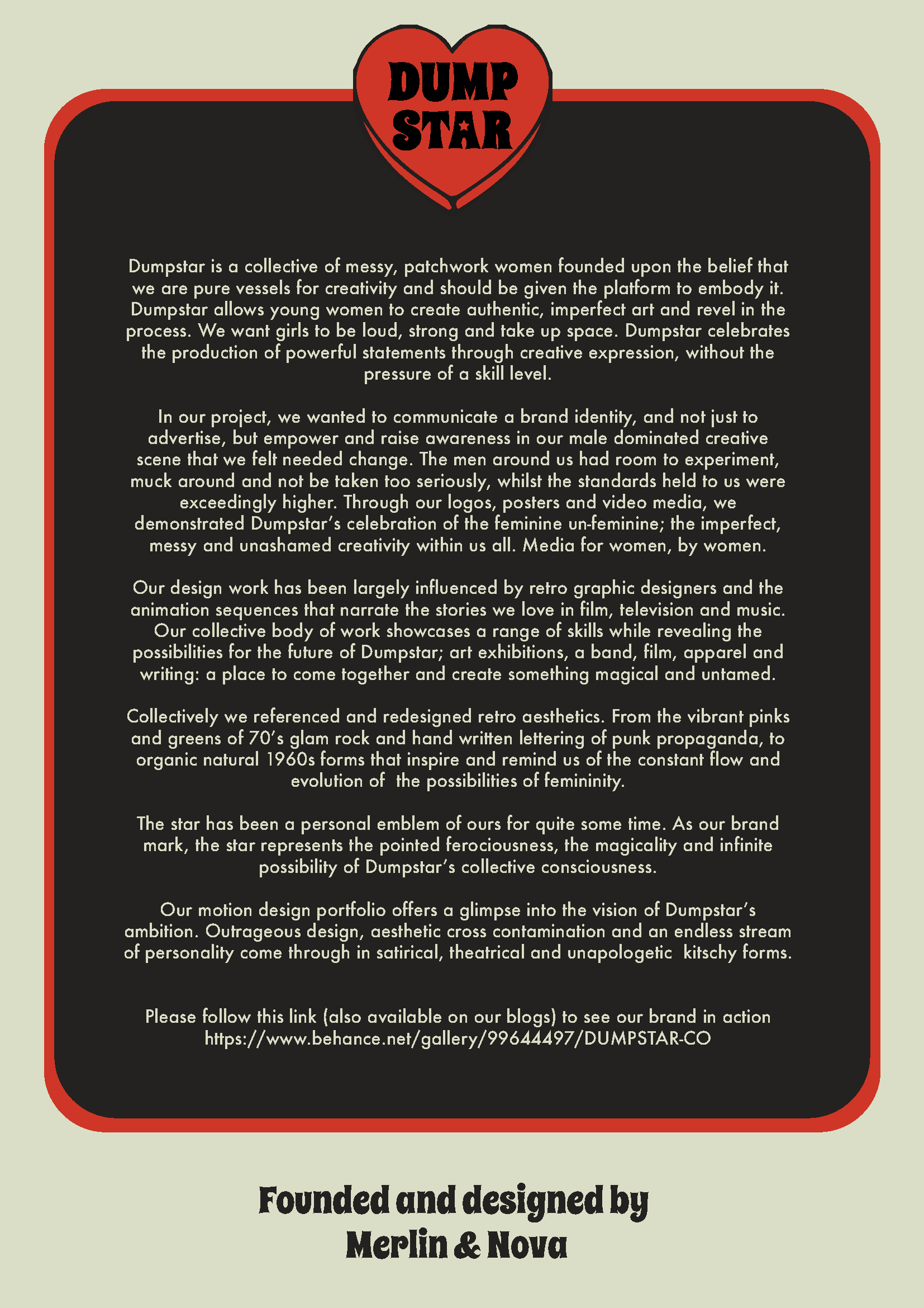
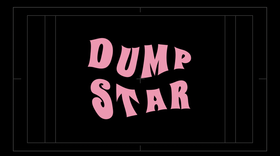
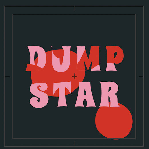
The major project Nova and I collaborated on was Dumpstar, a personal creative project we have been ideating and discussing for two years now. The premise began as hunt for a band name while become larger as we found ourselves making creatively in many different fields; art, music, writing, design, fashion… this is where Dumpstar as a female led collective of creative women began. Dumpstar acts as a name head for a group of women who already exist and intend to grow larger.
Under the motion graphic principals the idea of animated branding and communication possibilities struck our attention as we were searching for a way to kickstart Dumpstar. Previously it had kept falling through the cracks as we tackled university majors focused on other areas. This project was driven by passion and motivation to make some real evidence and communicate our ideas of what Dumpstar can and will be.
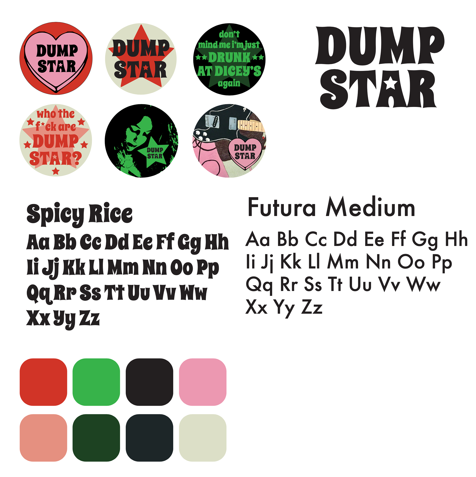
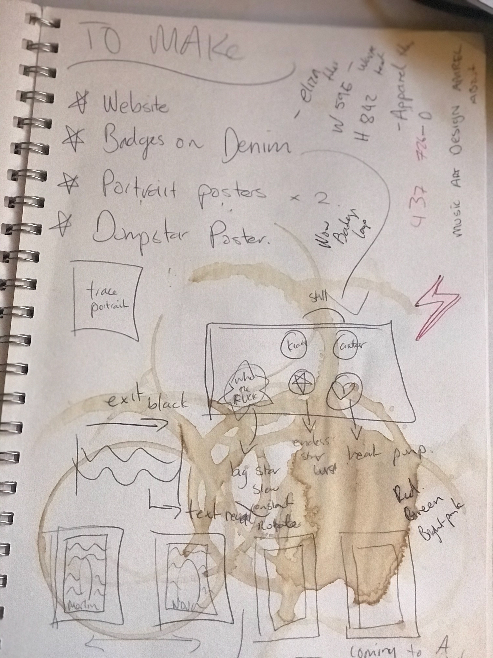
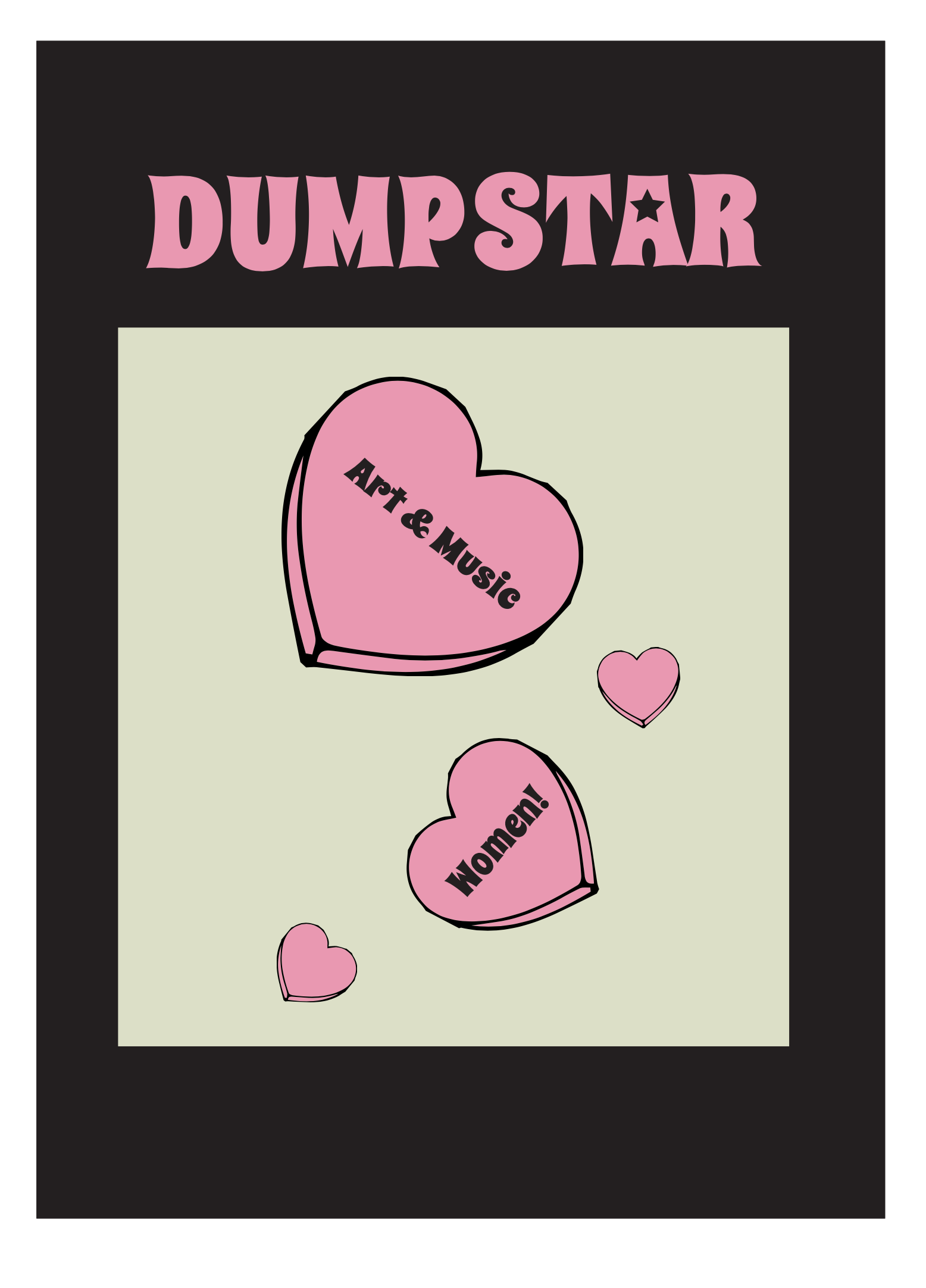
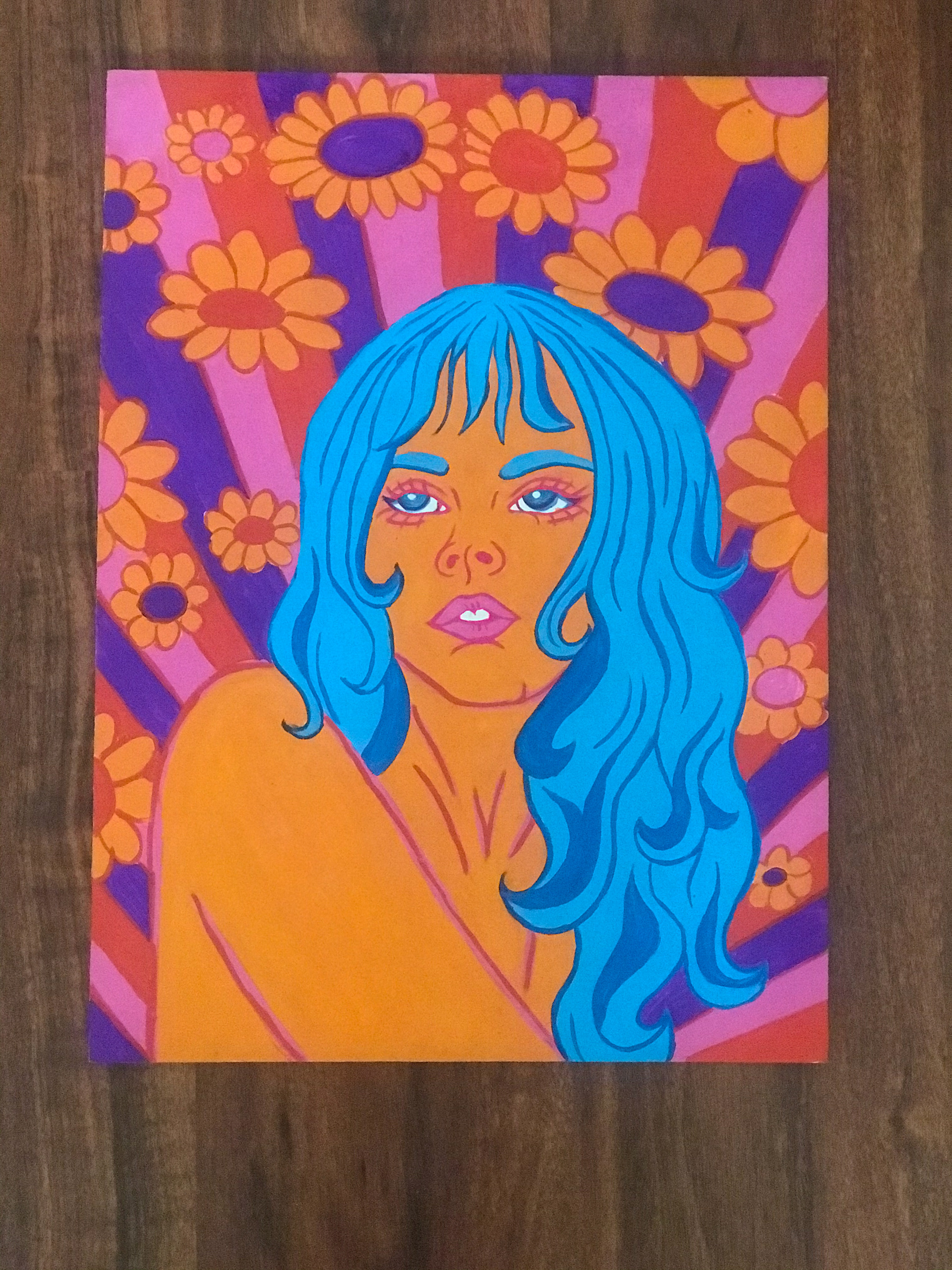
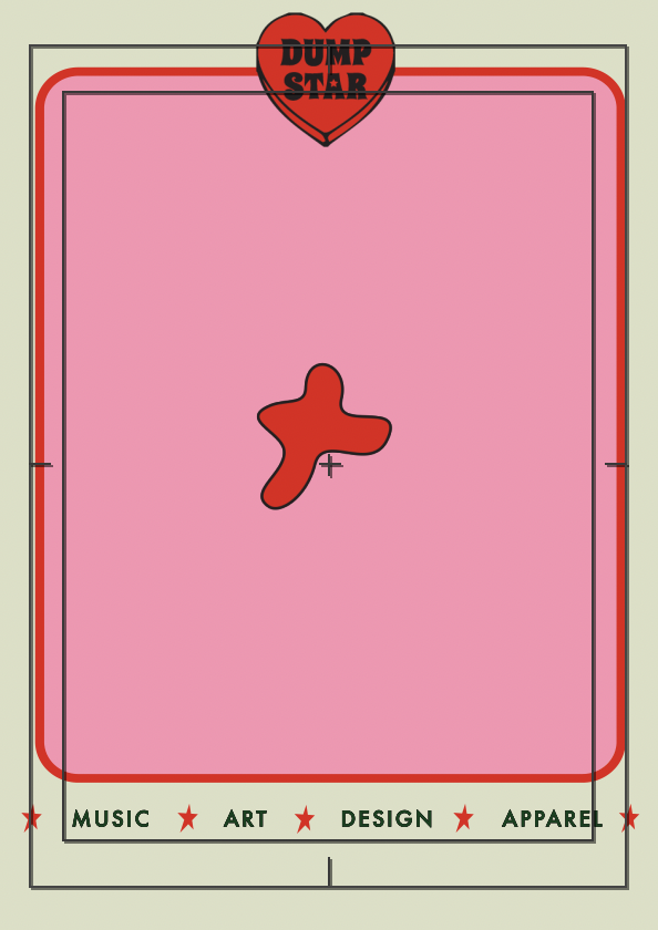
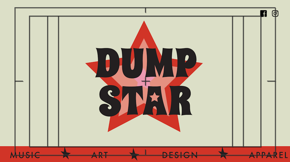
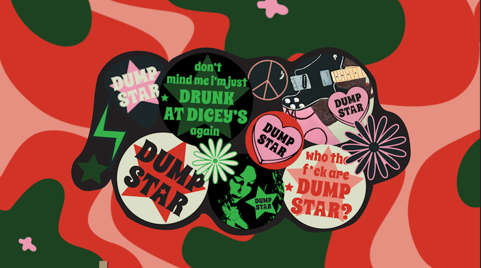
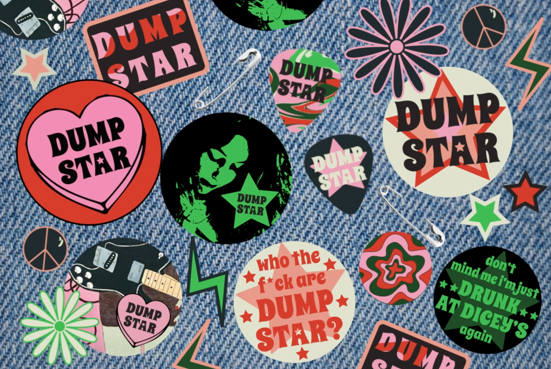
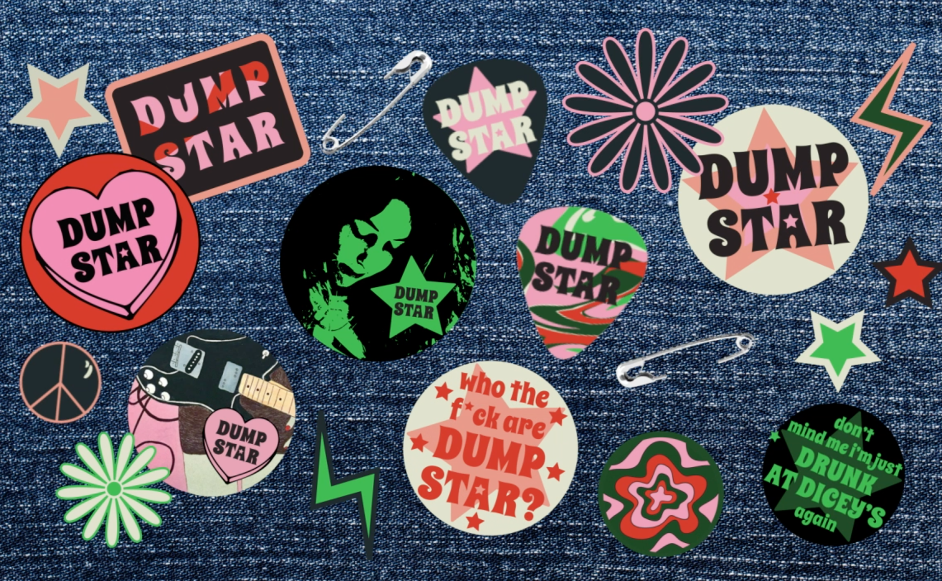
Our colour pallet, typeset and logo mark had been decided in previous design work Nova and I did at the beginning of the year to get badges printed. With this is completed the exciting part was the application of design ideas into moving graphics and animated sequences. We began brainstorming possibilities, Instagram ads, moving posters, badge animation, film clips for song demos, typographic lyric video, Dumpstar trailer/infographic, the ideas were endless.
“Your choices of forms, colour, language, and typography can all speak to the core conflicts embodied in your concept.” (Lupton, 2011, p 69)
In the beginning we felt overwhelmed with possibility, which led us individually experimenting and sharing ideas before creating a concrete mission in the last weeks. We got together and allocated work, both us sharing bits and pieces of the work we had completed and the work we were going to make. I was going to animate the badges, we planned how they would look and which ones would move. Nova was working hard on animating an entire video which was a long and tedious process that she did and amazing job on. I was working mostly graphically in illustrator, looking at making posters, mock-ups for badge displays, psychedelic and logo compositions that could be reapplied to make the branding cohesive.
1st critical moment: making ugly things with foundational skills
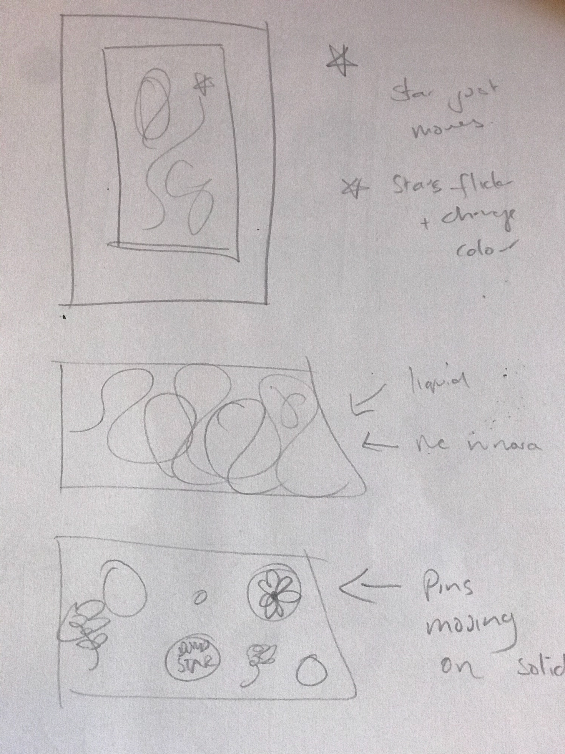
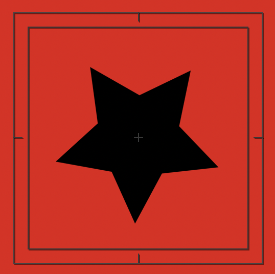
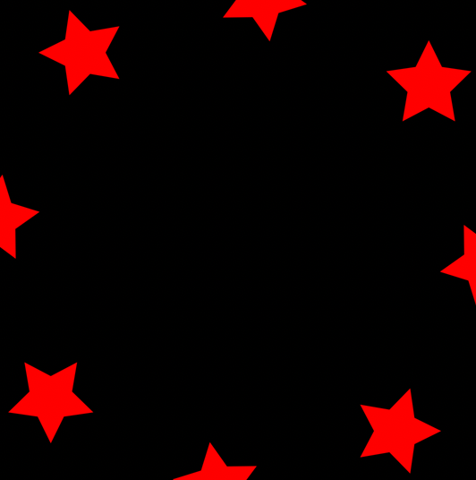
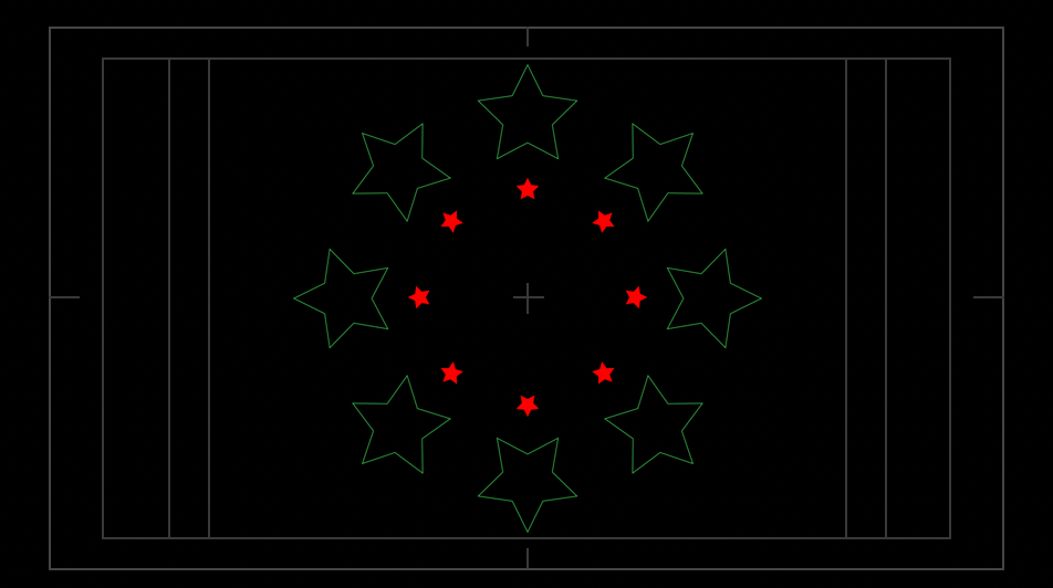
It felt very ambitious, exciting and intimidating to collaborate on a university assignment about personal project. So we began working from our skill set gained from the first assignment. I initially explored creating star animations using primary animation techniques such as rotation, scale, opacity, and position keyframing. I then transferred into creating still compositions in illustrator to transfer and try to animate in After Effects. This huge learning process about layers and converting files to be used effectively in illustrator. This was very tedious and ultimately very ugly at first.


2nd critical moment: making cool things with old and new skills with more graphic design elements.
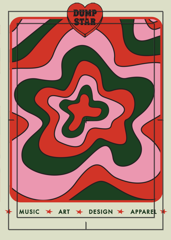
After making too many ugly things I began exploring the effects panel and applying transitions and keyframing to more graphic design and title sequence animation inspired work. I used two effects only in this project; wave warp and turbulent displace, both of which distort composition elements to help balance keyframing and distortion with easy ease to create cohesive warping instead of the disjoined keyframing fails that I had poorly navigated through earlier. Previously I had used primary motion editing to create repeating elements that made a psychedelic sequence out of diamond shapes. As this project was more influenced on fluid and organic shapes I experimented with 2D hand drawn animations to create colourful sequences that could be used as transitions or reapplied across different compositions.
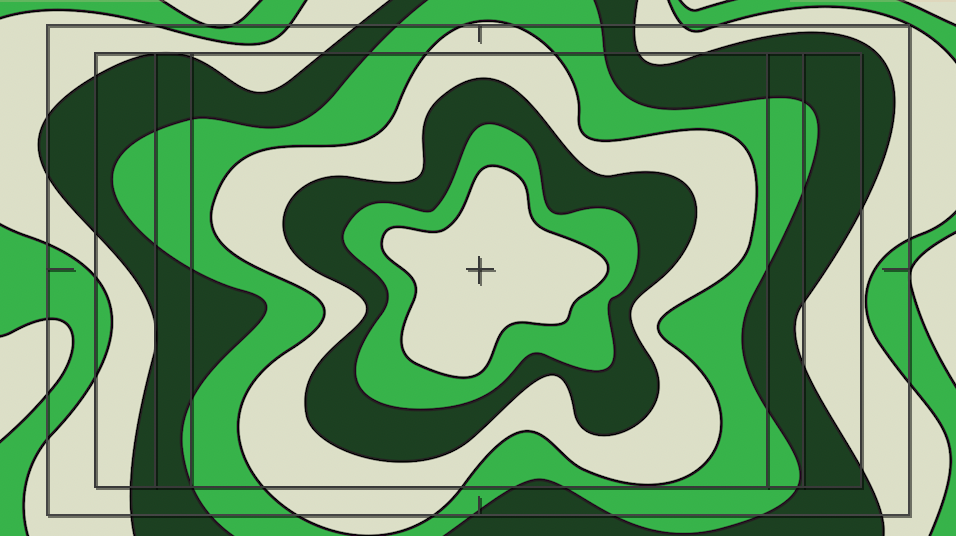
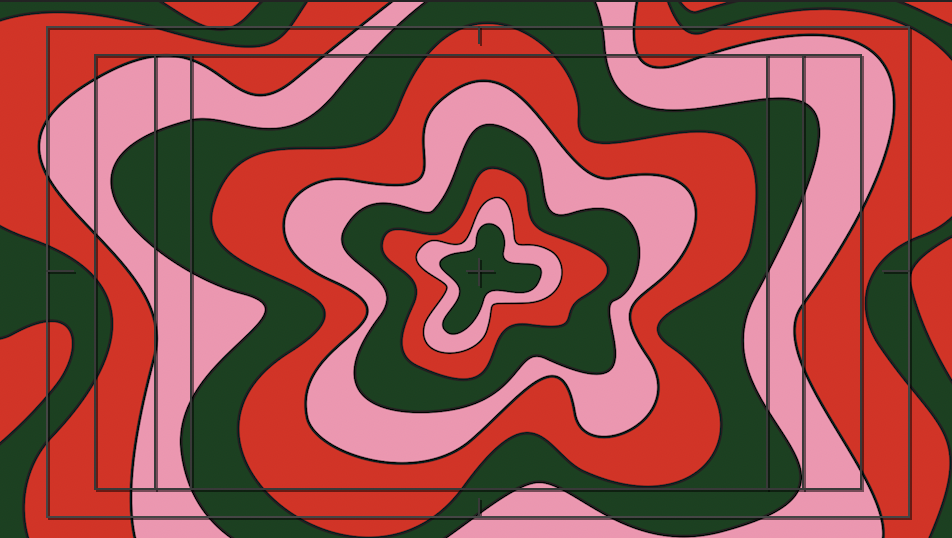
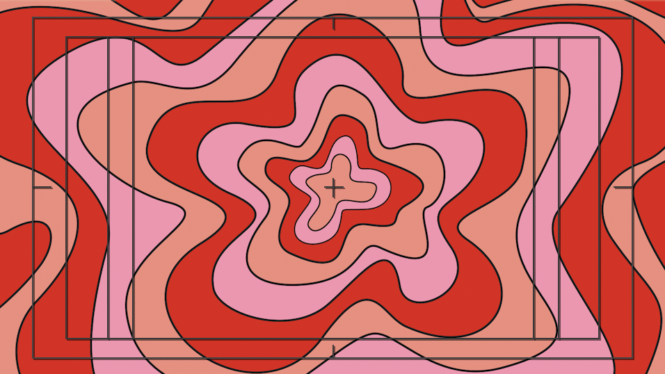
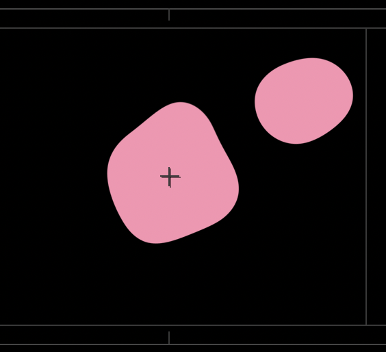
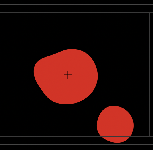
I worked on creating liquid transitions and blobs, this was hard to master and took many attempts, my workspace got very convoluted and it wasn’t until 4 days of experimenting that I had figured out how to mimic a kind of lava lamp growth sequence. “Change in Shape: letting a line wander can produce all types of shapes: abstract, amorphous, representational” (Lupton & Philips, 2008) I loved exploring this kind of animation style as it was similar to my illustrative practice as a visual artist.
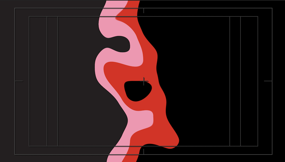
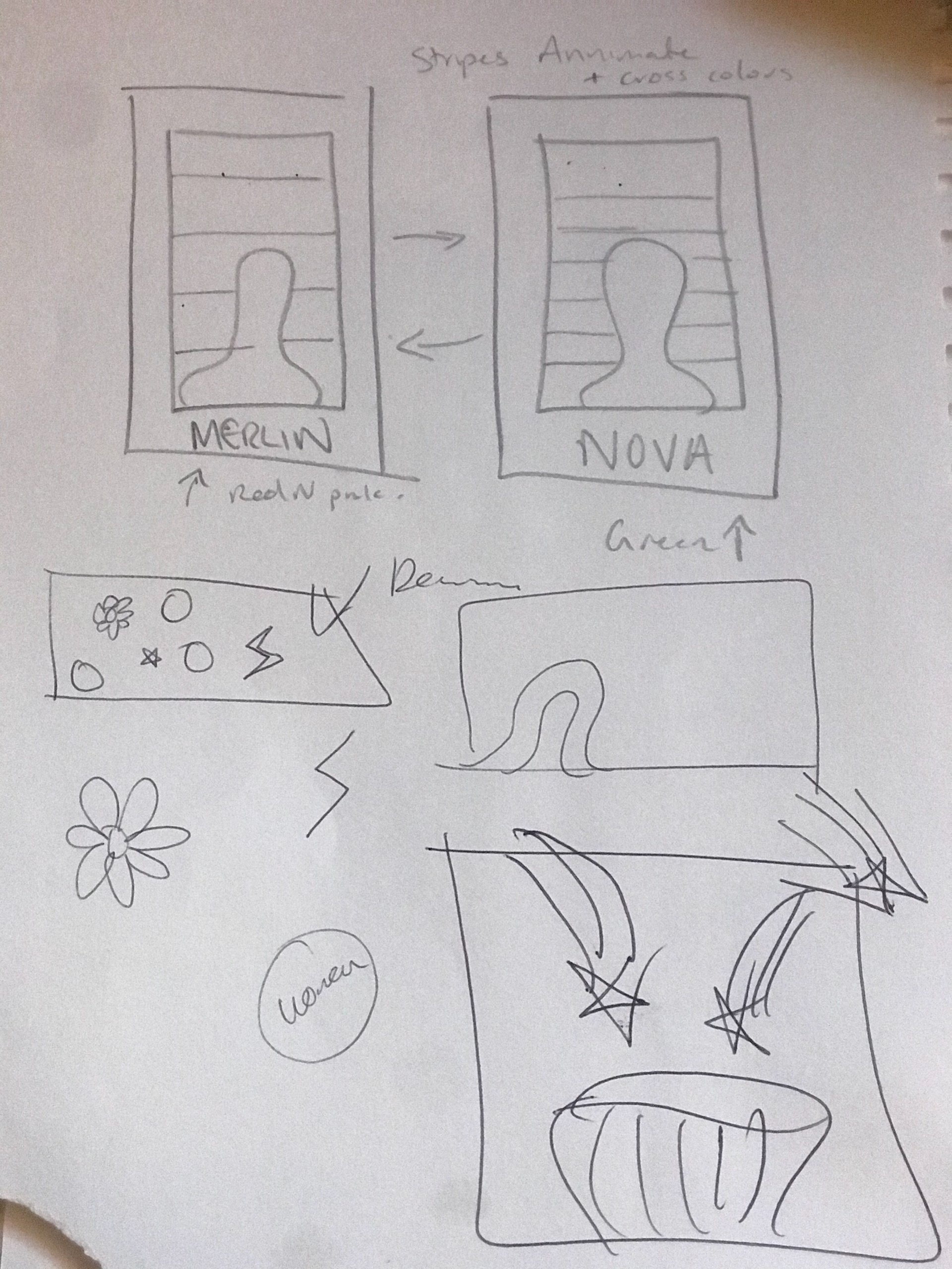
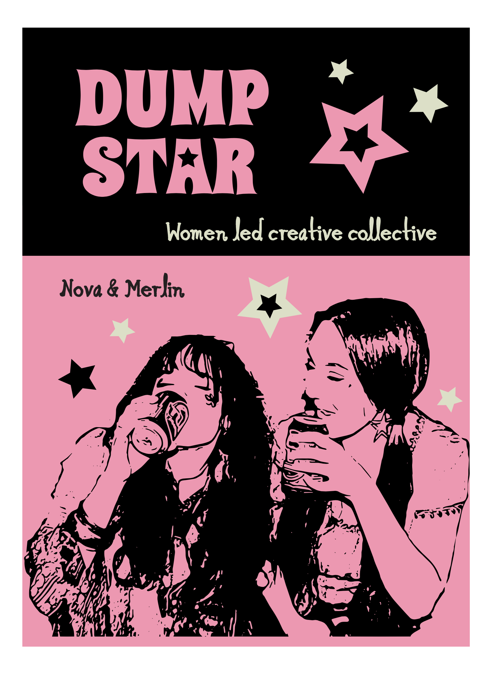
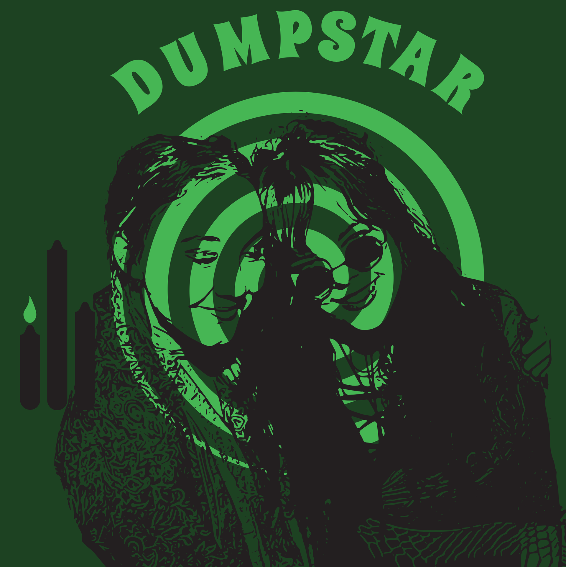
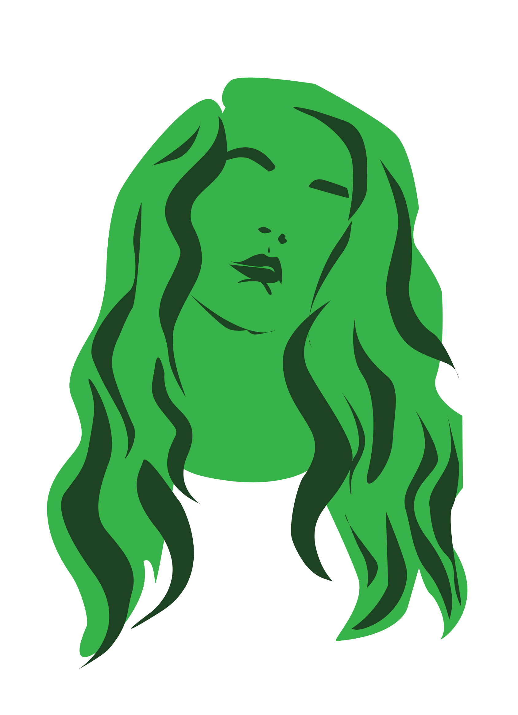
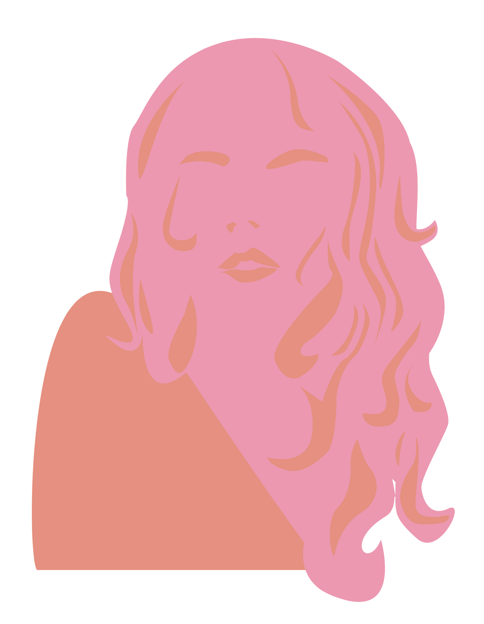
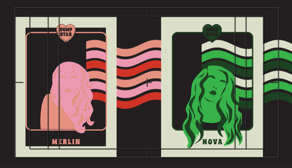
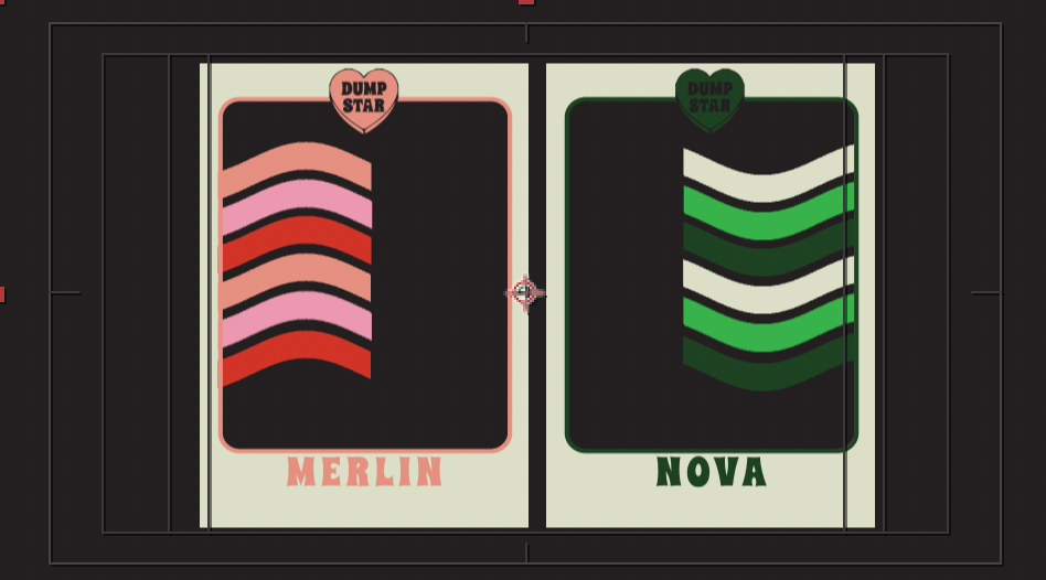
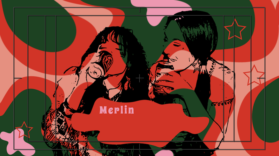
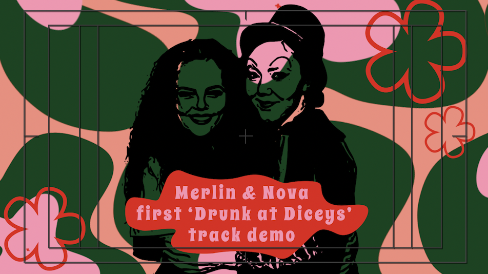
I referred back to past work to create updated silhouettes portrait posters of Nova and I in illustrator before editing them to move in After Effects. I used primary animation to animate these posters. I would have liked to refine them further by learning how to animate hair (which I started), and also working more typographically into the piece. Though the colours are bold and stark I believe simplicity in some compositions was necessary, such as the website and the portrait posters that utilised “concrete structure” (Leborg, 2006) motion to stabilise imagery against the more organic compositions.
The badge compositions have a layered collage feel that I really enjoy. I am very proud of these; I think they look really engaging and adding in small elements of animation to them maintain interest as you navigate through each element. With the premade designs and bold colour pallet simple primary techniques ensured a composition would retain its integrity without overwhelming the piece. “A word or design element can stay still while the environment around it changes.” (Lupton & Philips, 2008)
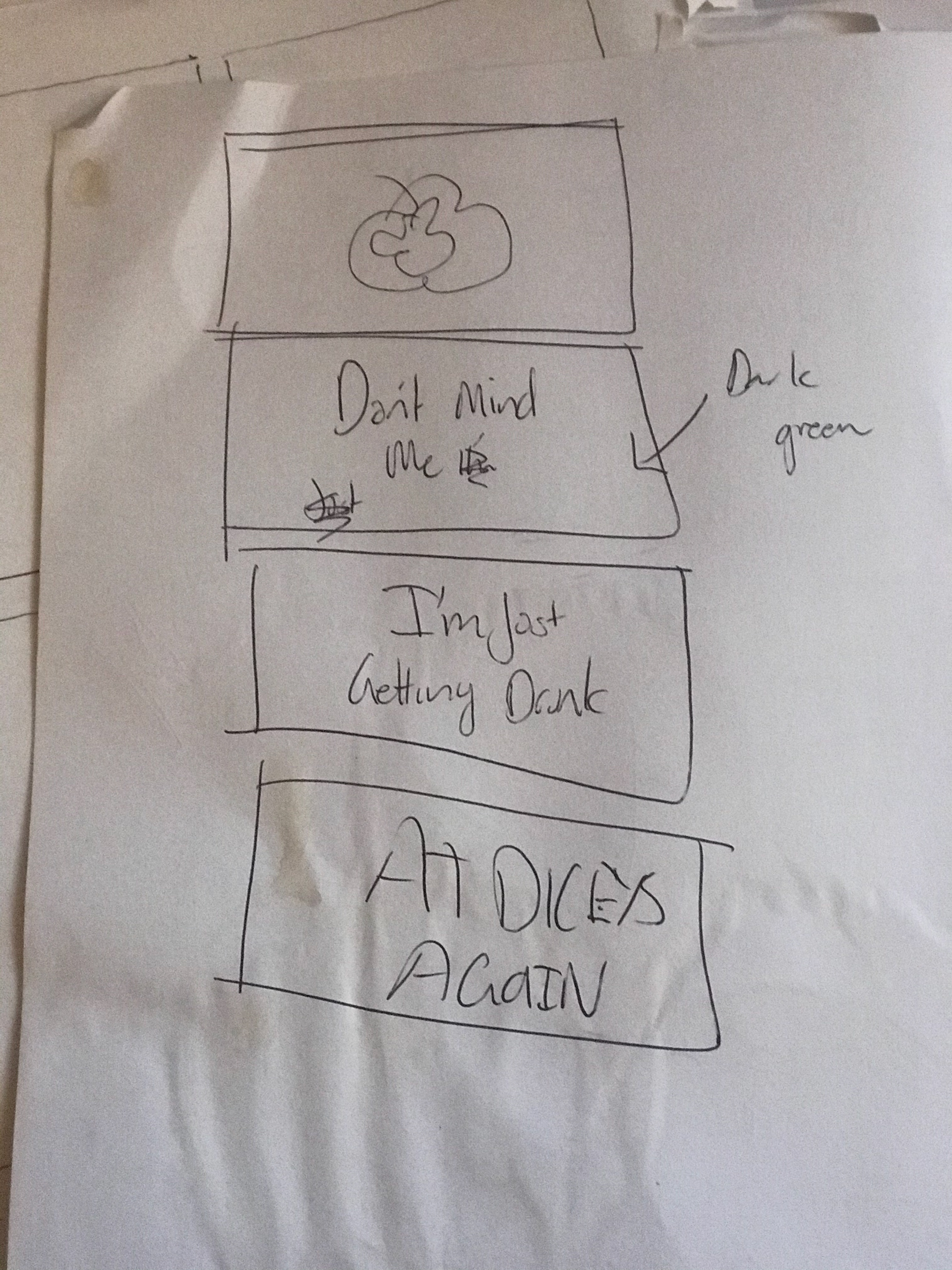
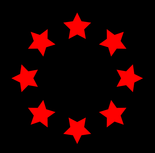
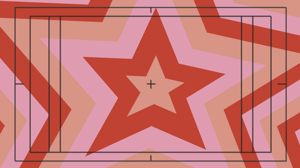
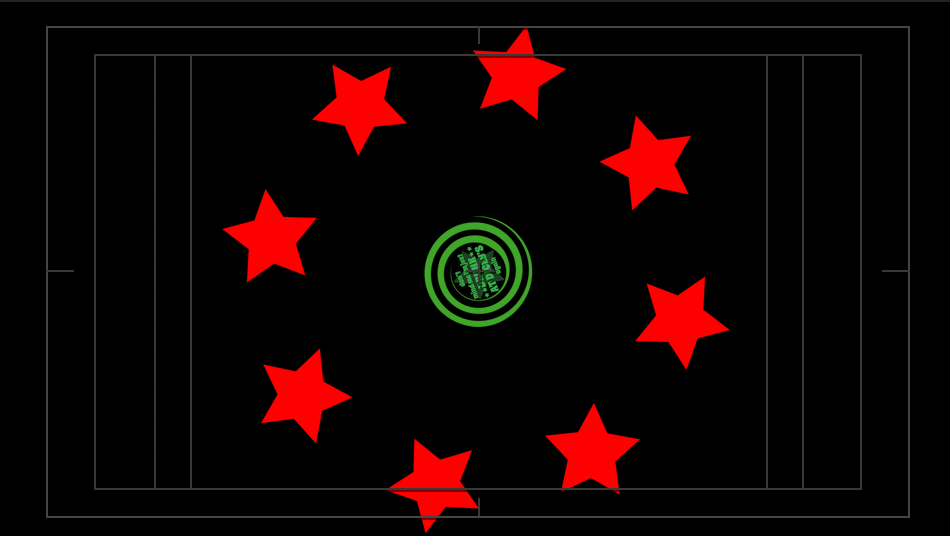
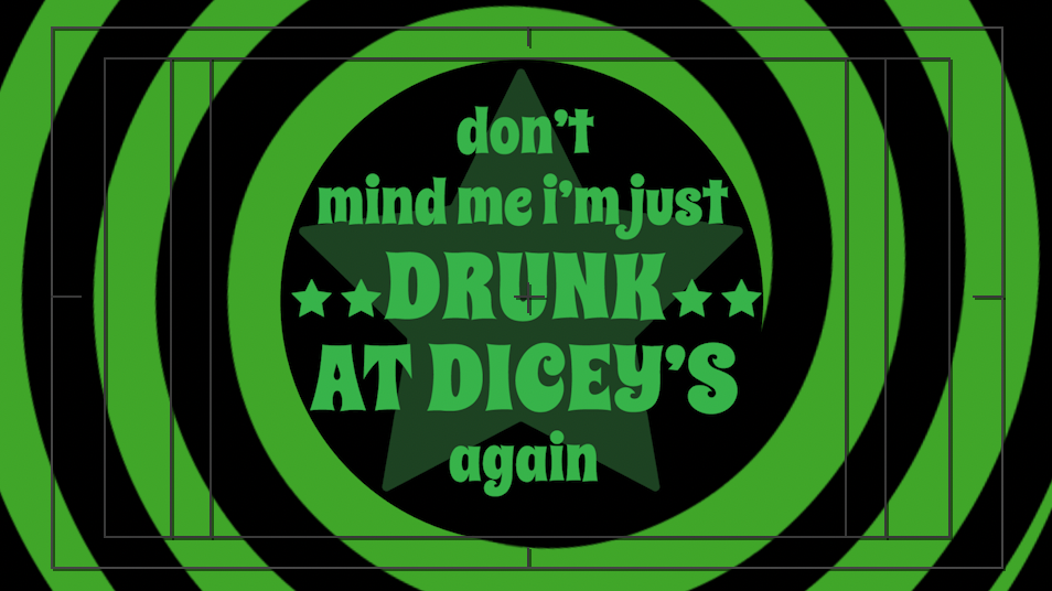
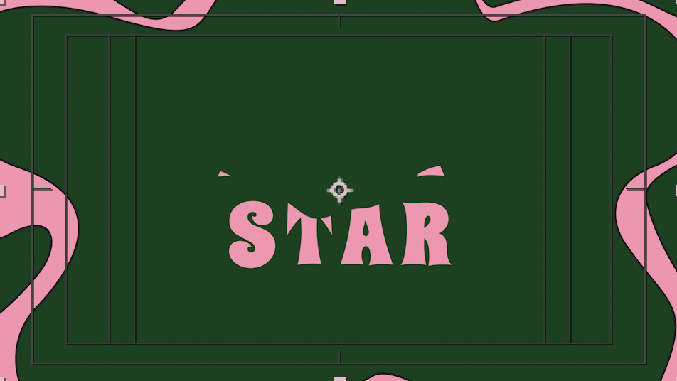
Contrary to that statement I wanted to create a messy animation of simple shape techniques learned from the first assignment. The 18 second long ‘demo track’ is actually Nova and I’s first music practice session ever, where we had a half written song and lots of laughs. Its messy, off key and kind of embarrassing but that is the brand we are advertising! My favourite discovery making that sequence is inverting polygon points inward and outward to make a star into a flower, as Nova is always associated with stars and I with flowers it was happy accident to discover that.
Though I am satisfied with what we produce, some compositions are highly refined while other I believe could have further explored animation possibilities. Though this was a branding task for us, which is an avenue in which I believe motion is used sparingly and effectively.
3rd critical moment: successful collaboration, missing files, PRIDE and POSSIBILITY
The most satisfying part of this project is our successful collaboration experience and the pride we have for what we created. Dumpstar is our love child and we are so proud of her in motion. Though this did not come without its difficulties. Nova and I are great collaborators, we delegate evenly, make creative decisions critically and constructively, our biggest issue was technology.
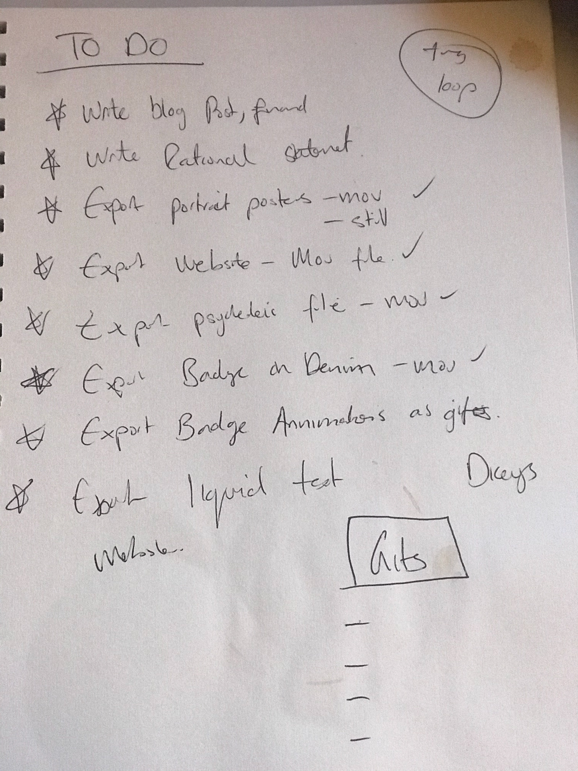
We found we worked best when we are working in the same space at uni, getting immediate gratification and analysis on work and exploring new ideas. We shared a lot of content, and transferring files to one another could be incredibly difficult at times, a lot of times parent files were missing and took many attempts to be successful. But we knew this would be an issue so we aimed to complete our designs in time for technological error that may occur upon upload, which it did. Submission night we spent several hours trying to export from aftereffects our odd sized compositions without the black borders and set up our Behance page to collectively showcase our work as it is so interwoven as project between the both of us.
Upon submission we are very happy with the final outcomes of the project and excited to continue working on Dumpstar in the future. Looking back, both of our skill sets have largely increased and we now find it far easier to navigate through the AfterEffects software. Secondly our successful collaboration excites us for future work together in a professional setting. This has been a very rewarding subject! Thank you Wes!
“Effective collaboration yields something new, not a Frankensteinian mash up of parts. In a productive team, each member has ownership over some aspect of the project, bringing a valuable set of perspectives and skills to the group, but each person is willing to merge individual ideas into the bigger structure.” (Lupton, 2011, p 92)
please follow this link to our collaborative Behance page to see our work in action
sources:
Leborg, C 2006, Visual Grammar, Princeton Architectural Press, New York. Available from: ProQuest Ebook Central. [4 April 2020].
Lupton, E (ed.) 2011, Graphic Design Thinking : Beyond Brainstorming, Princeton Architectural Press, New York. Available from: ProQuest Ebook Central. < https://ebookcentral-proquest-com.ezproxy.uow.edu.au/lib/uow/reader.action?docID=3387597&ppg=177> [Accessed 29 April 2020].