“Humour, intelligence, and experimentation are integral to crafting engaging ideas. Sometimes, the best ideas evolve from conversations.” (Lupton, 2011 p.92)
Nova and I are really enjoying working together on this project. It is an interesting experience for us, and we are trying to treat incredibly professionally but often our friendship gets in the way. With the other design subject VCD301- Professional Design Practice we were introduced the difficulties and achievements that come from group design work and client work. Both of us shared good and bad aspects of those group projects but found a breath of fresh air when working together with the same interests and goals about something we are so passionate about getting on its feet.
“Sit together. Work at the same table so that ideas can develop in relation to each other. Skype and iChat don’t count.” (Lupton, 2011 p.93)
The Dumpstar project finds us sitting side by side at our houses and by ourselves sharing progress work on a shared google drive and design ideas and inspiration regular over messaging and a collaborative mood board on Pinterest and Be hance.
“Make a database, be a sponge” (Lupton, 2011 p.79)
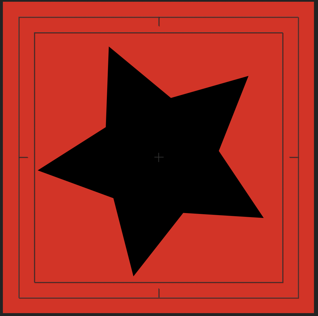
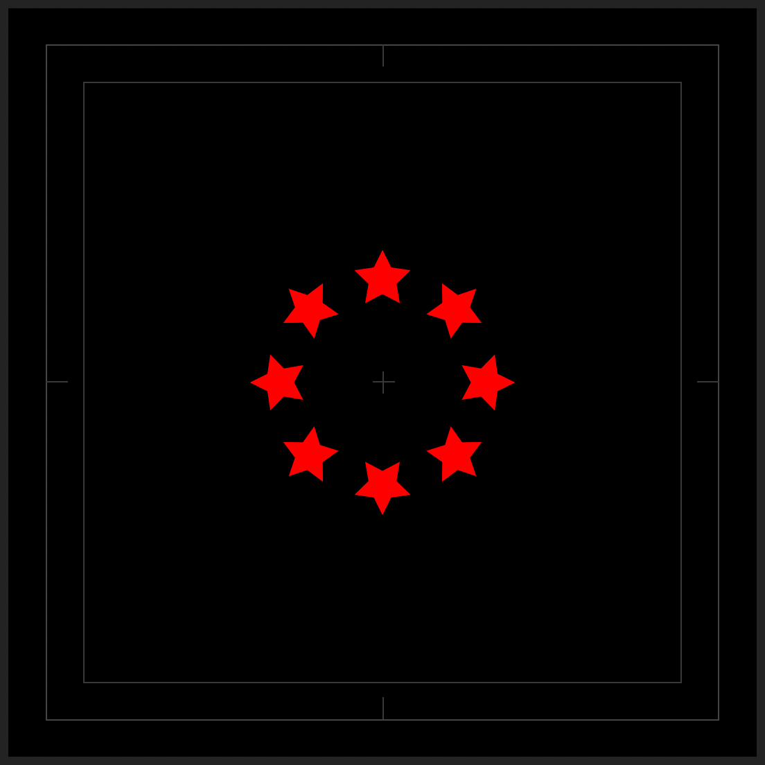
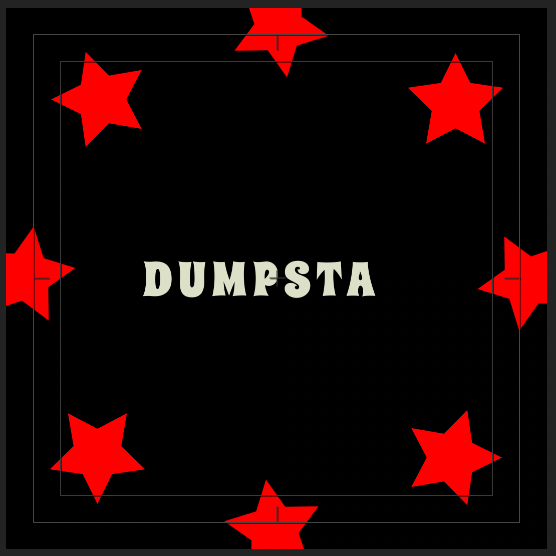
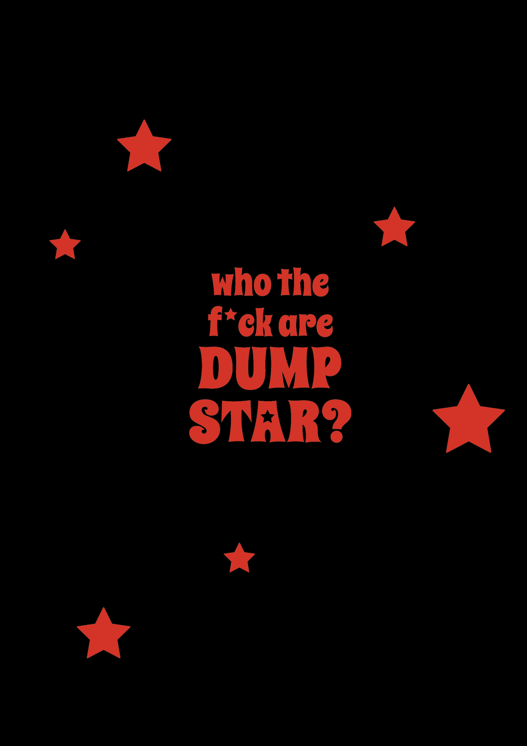
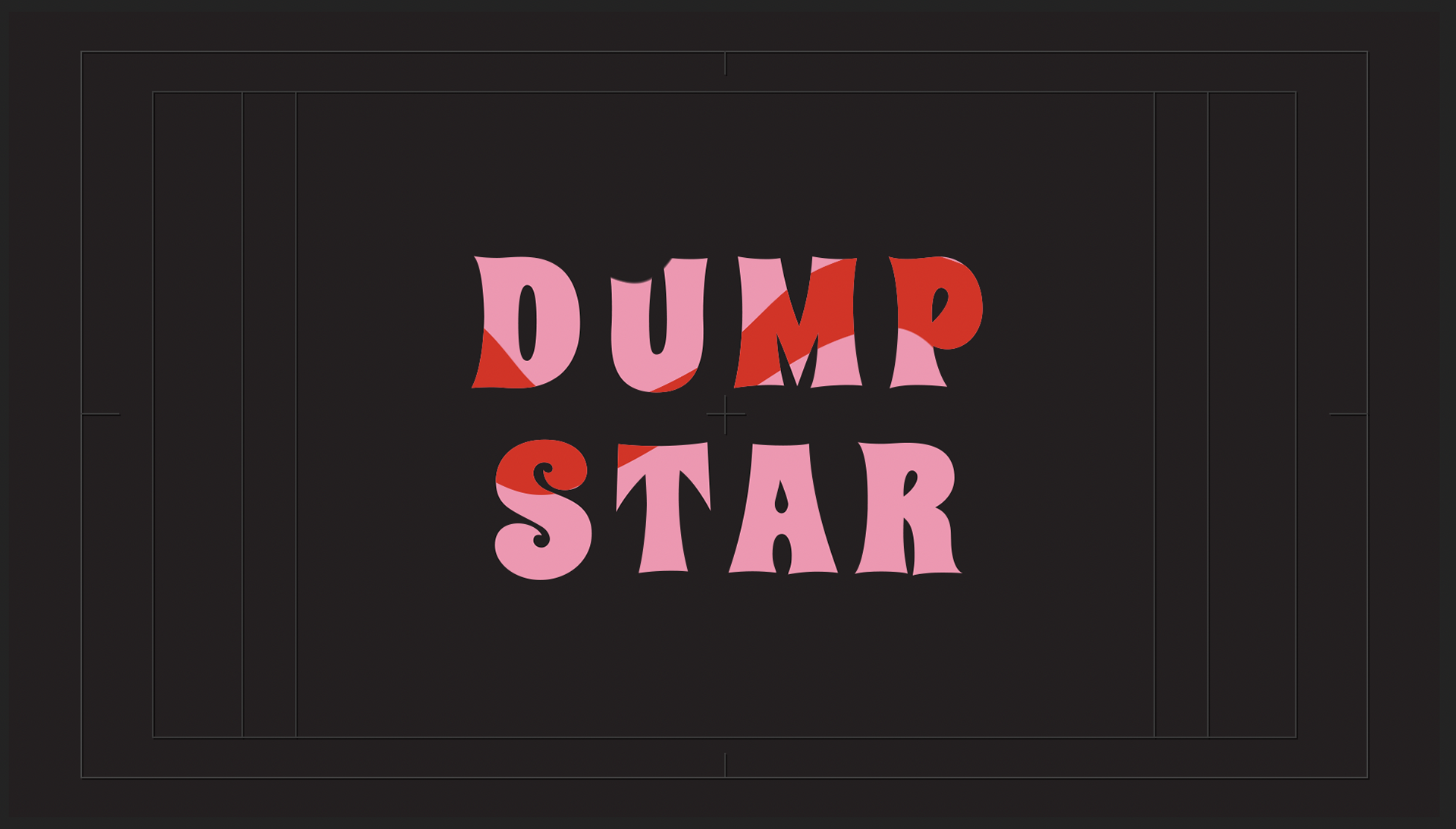
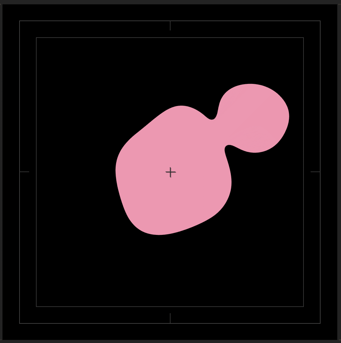
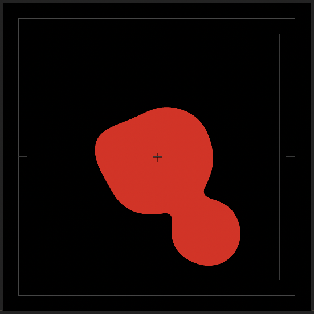
We outlined key ideas and focuses try to and establish a consistent style. Our style guide is summed up into key words: ‘retro punk witch vibe’, already established by the choice of colours and psychedelic typeface; Spicy Rice and our key emblem being the star.
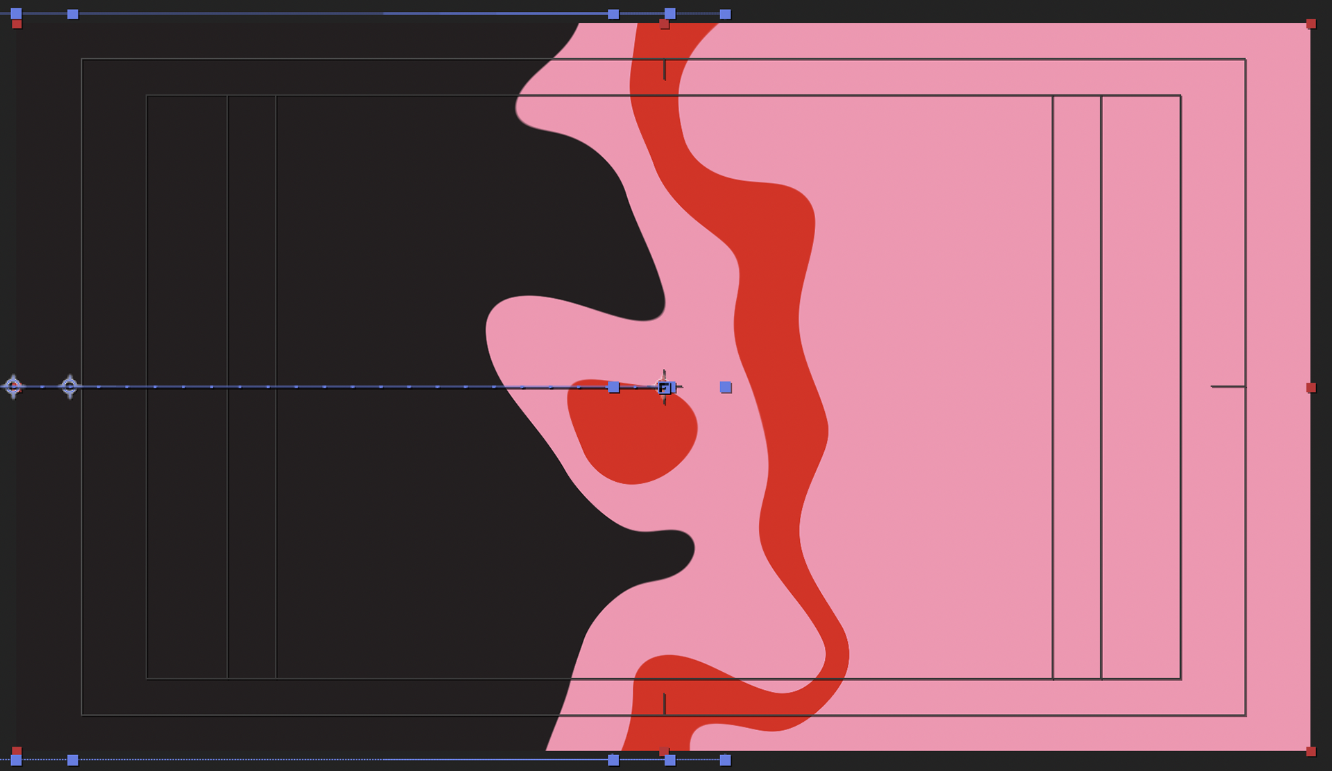
This hasn’t been too difficult a process as we have similar tastes and interests, but the design process is a bit different. We both have different skills and navigating our skill set in after effect while trying to retain a consistent style is a little concerning. We have discussed using a textured grain layer across all of our work to maintain a cohesive look.
“Design and communication strategies need to be thought out and developed to maintain a consistent and coherent line of thought that is repeated and reinforced through all communications.” (Ambrose and Harris, 2010 p.136)
So far, I am working on animating a website mock-up, animated posters and collateral advertising for the badges (physical ones) that will also move. We may be biting off more than we can chew content wise, but we are passionate and dedicated student and women working toward a band/brand name for ourselves!!
“Focus on how a team can achieve more ambitious results than an individual working alone.” (Lupton, 2011 p.93)
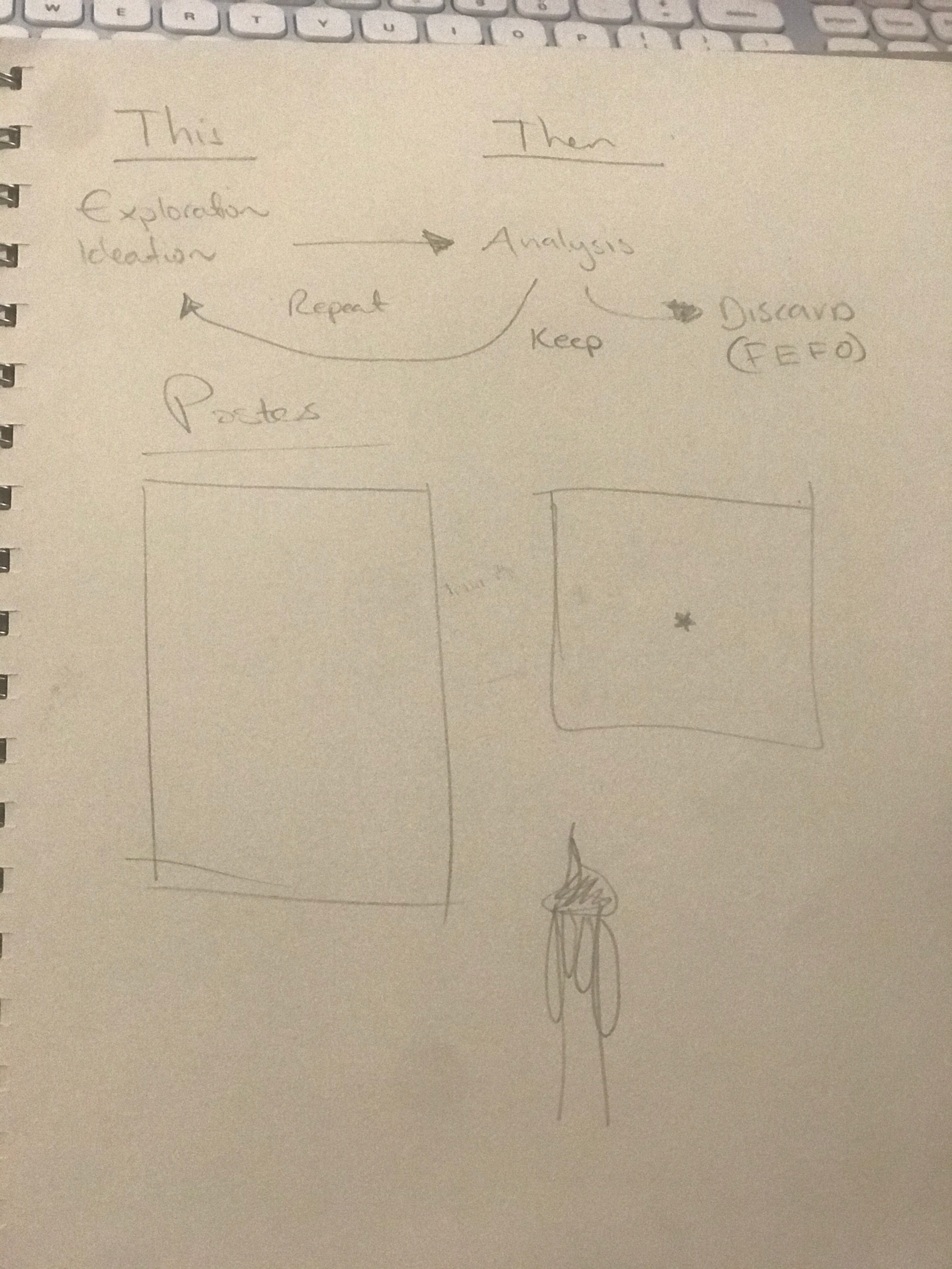
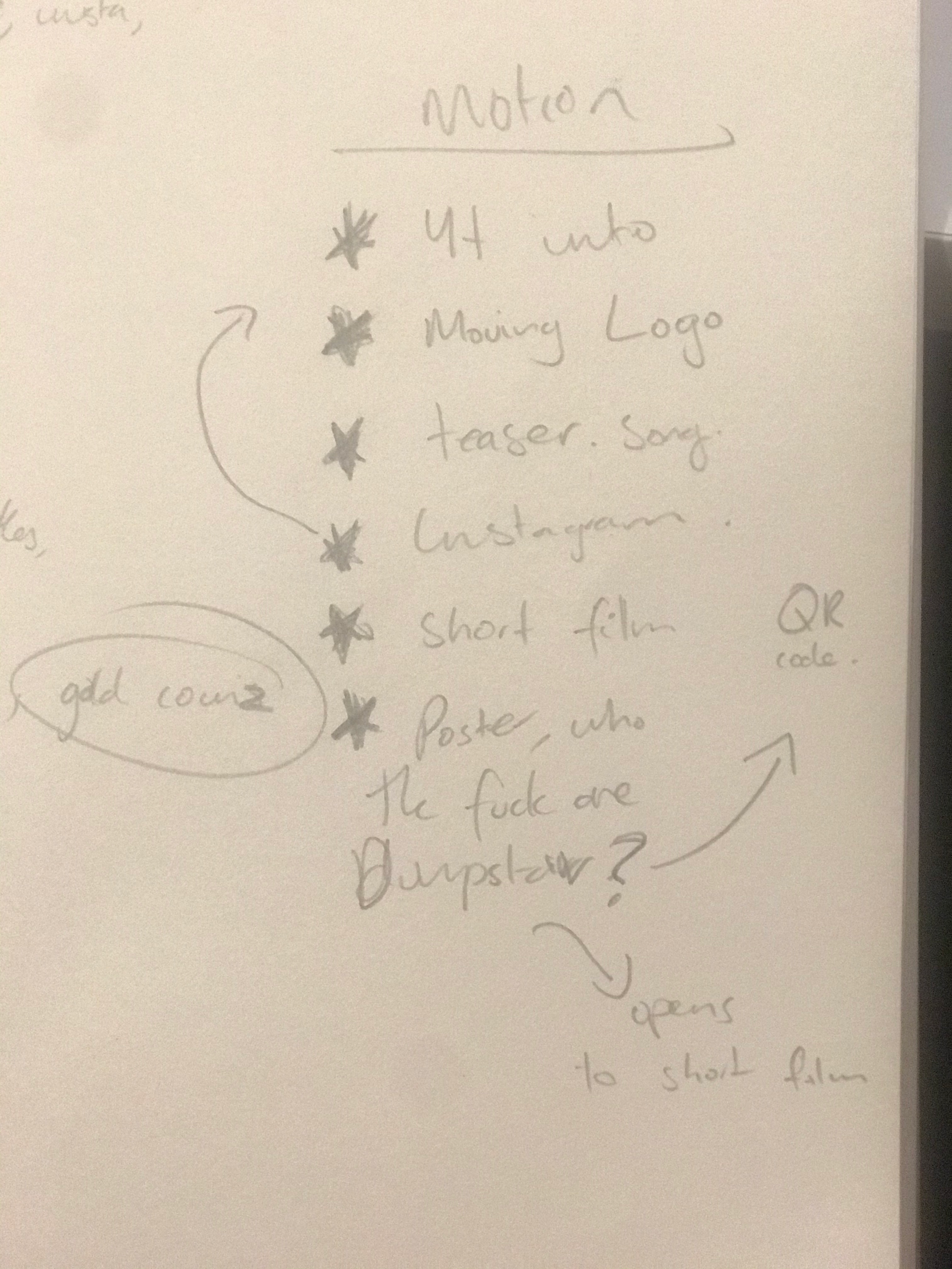
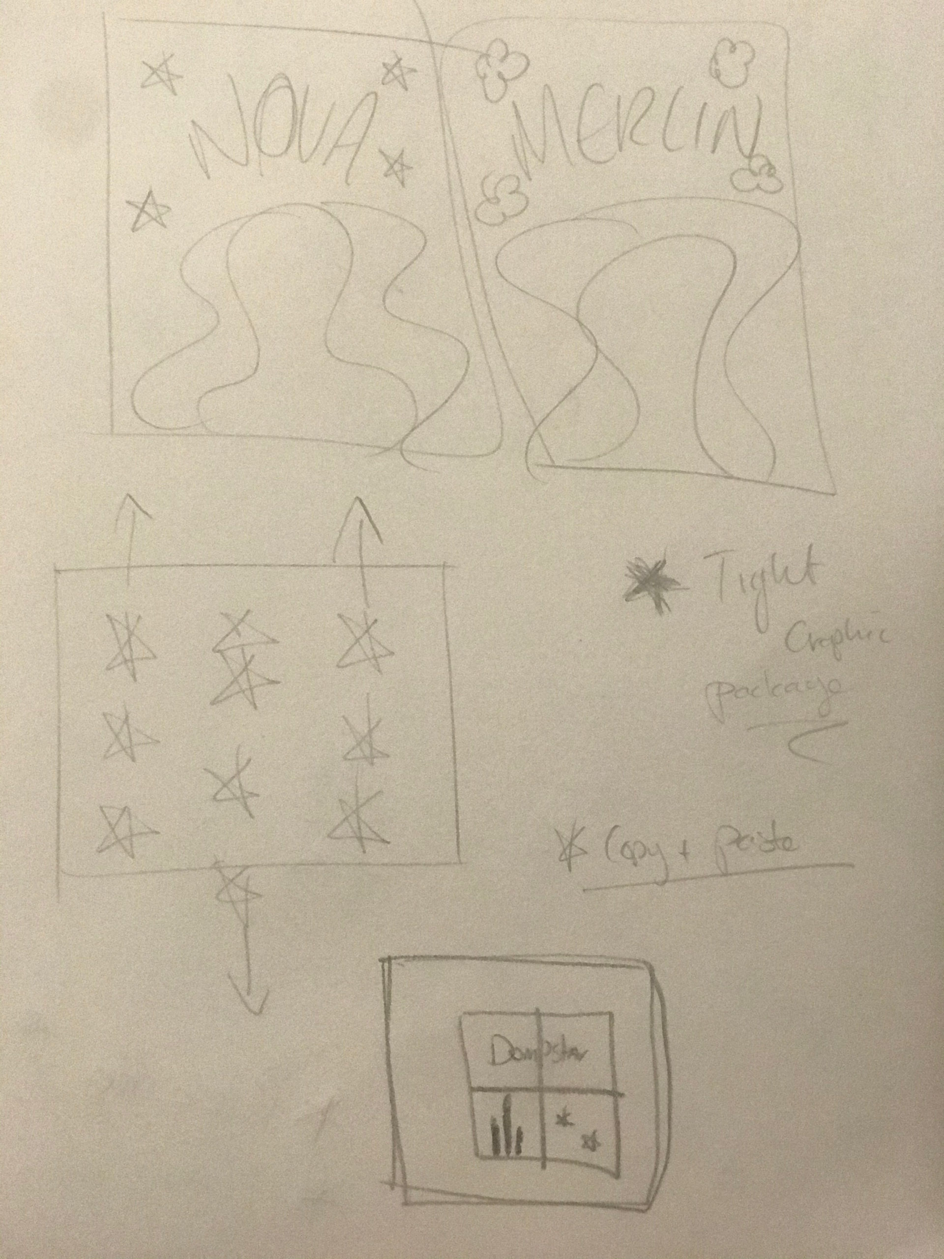
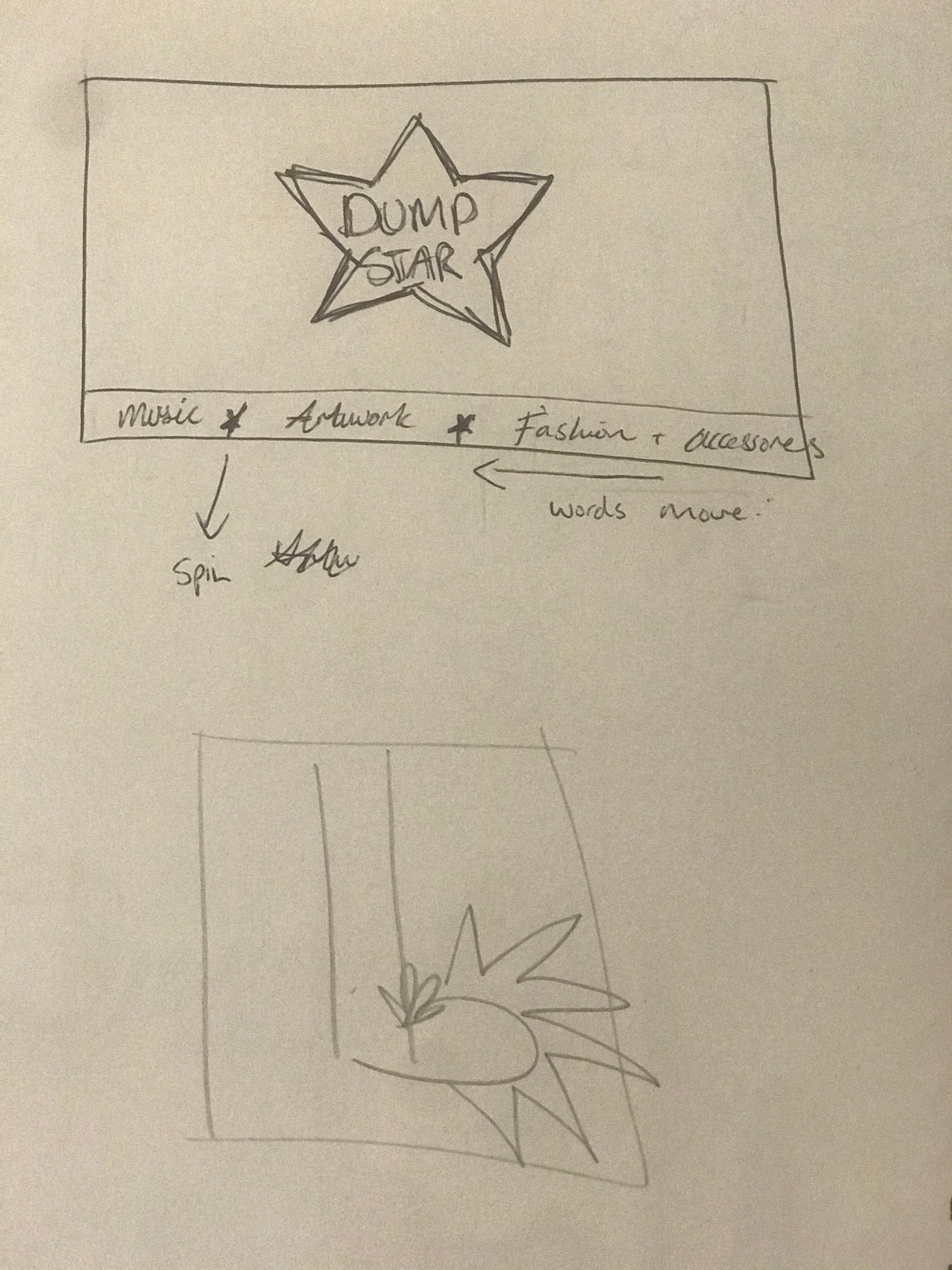
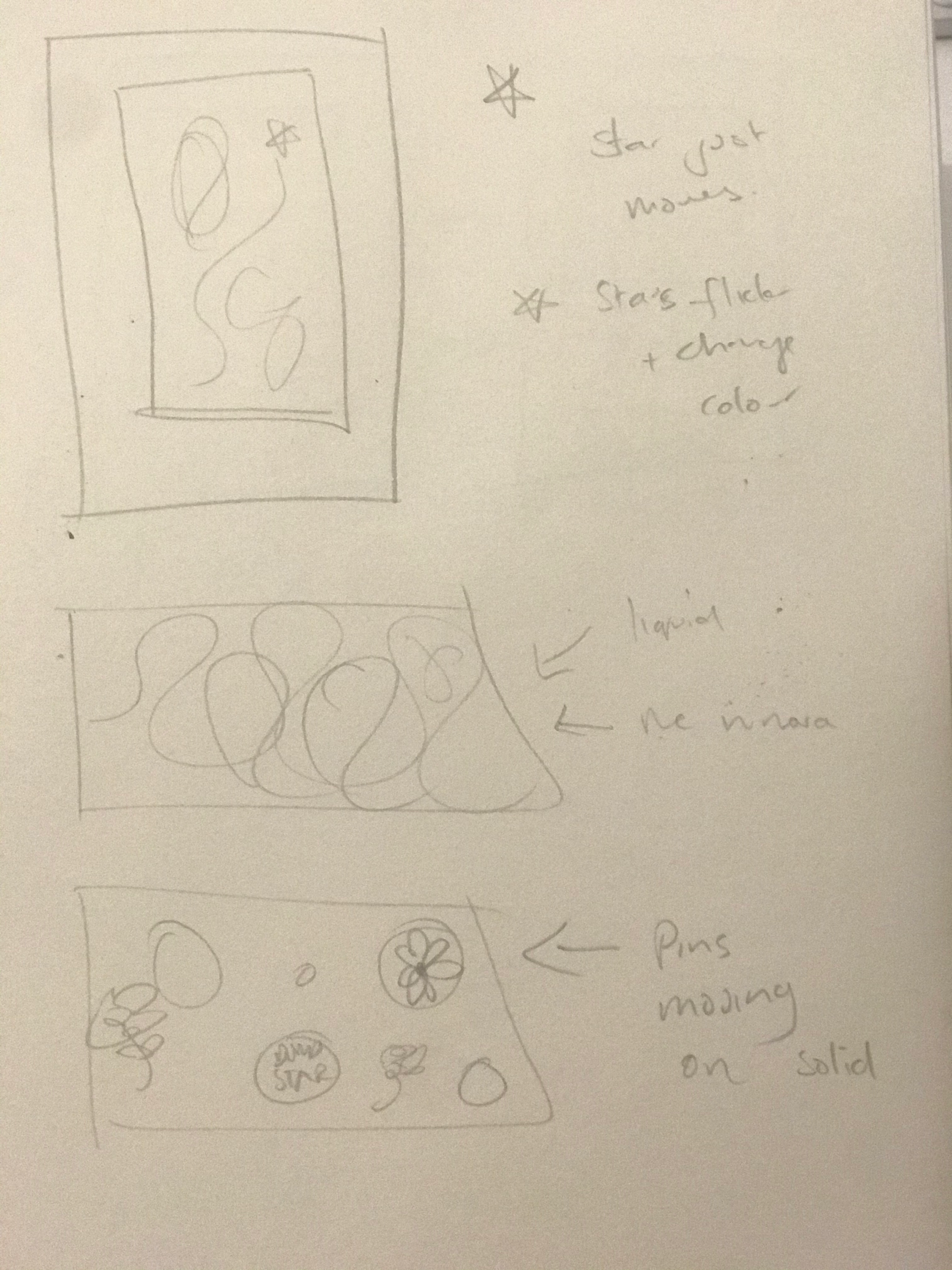
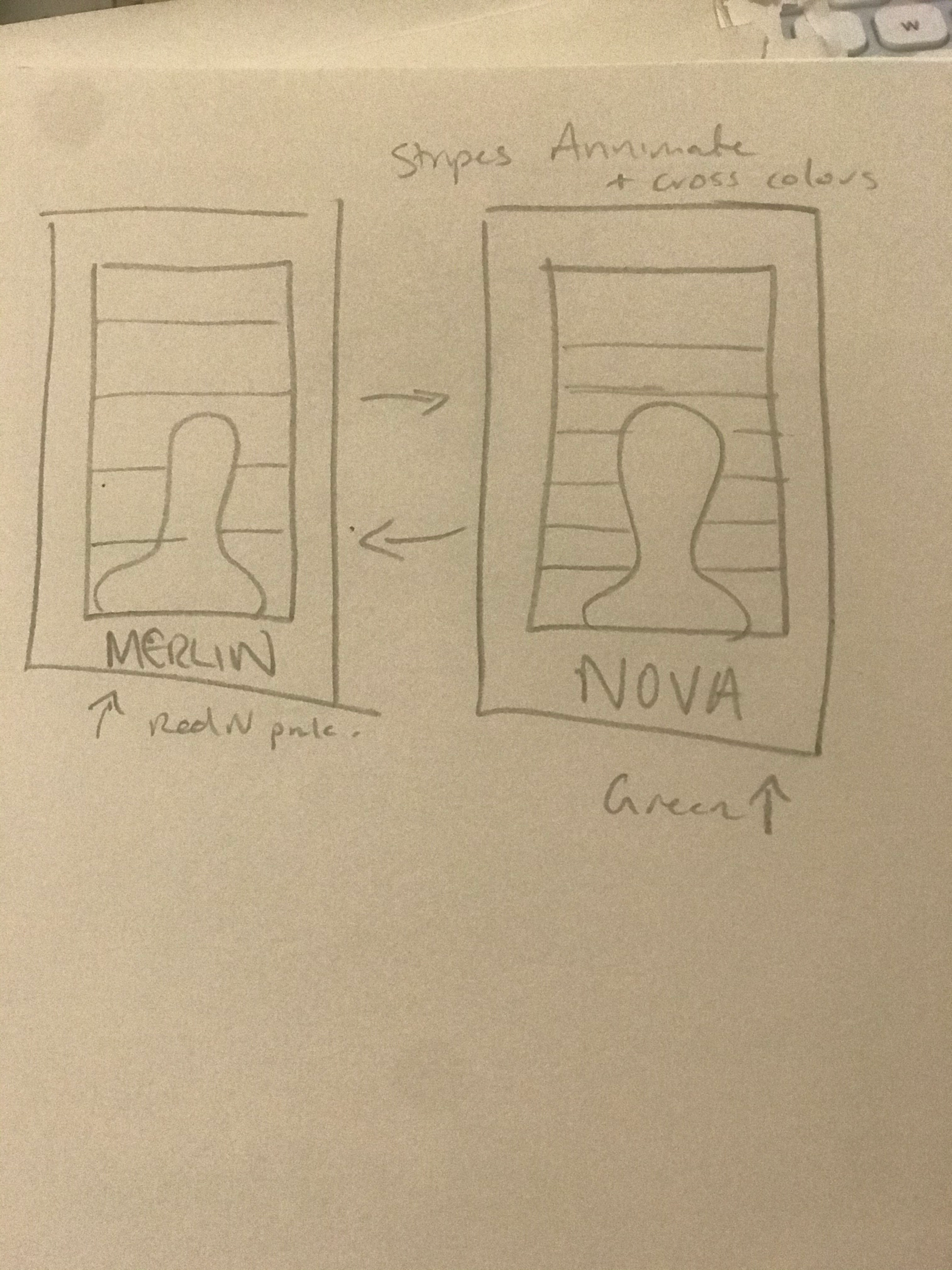
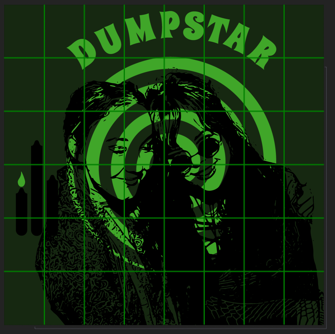
pages from Merlin's graphic design process journal (2020)


Pictures of the physical Dumpstar Badges (2020)
Stills from Dumpstar reveal motion graphic (2020) by Merlin Casey
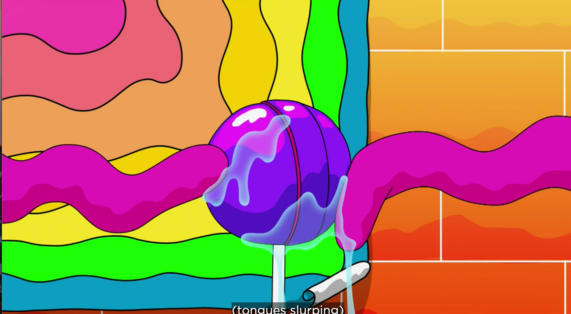
Stills from Dumpstar liquid sequence, 2020, by Merlin Casey
Stills from Dumpstar liquid sequence, 2020, by Merlin Casey
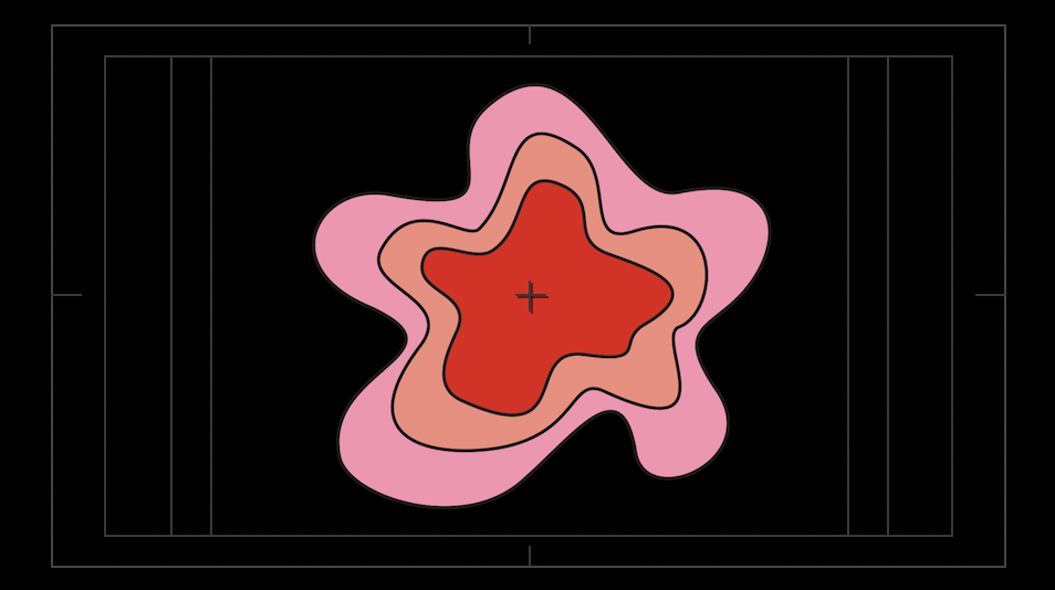
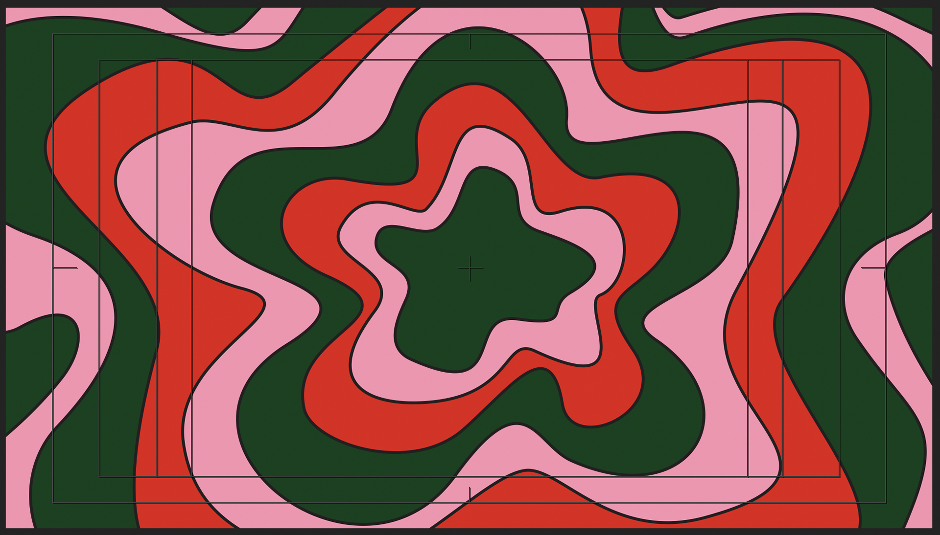
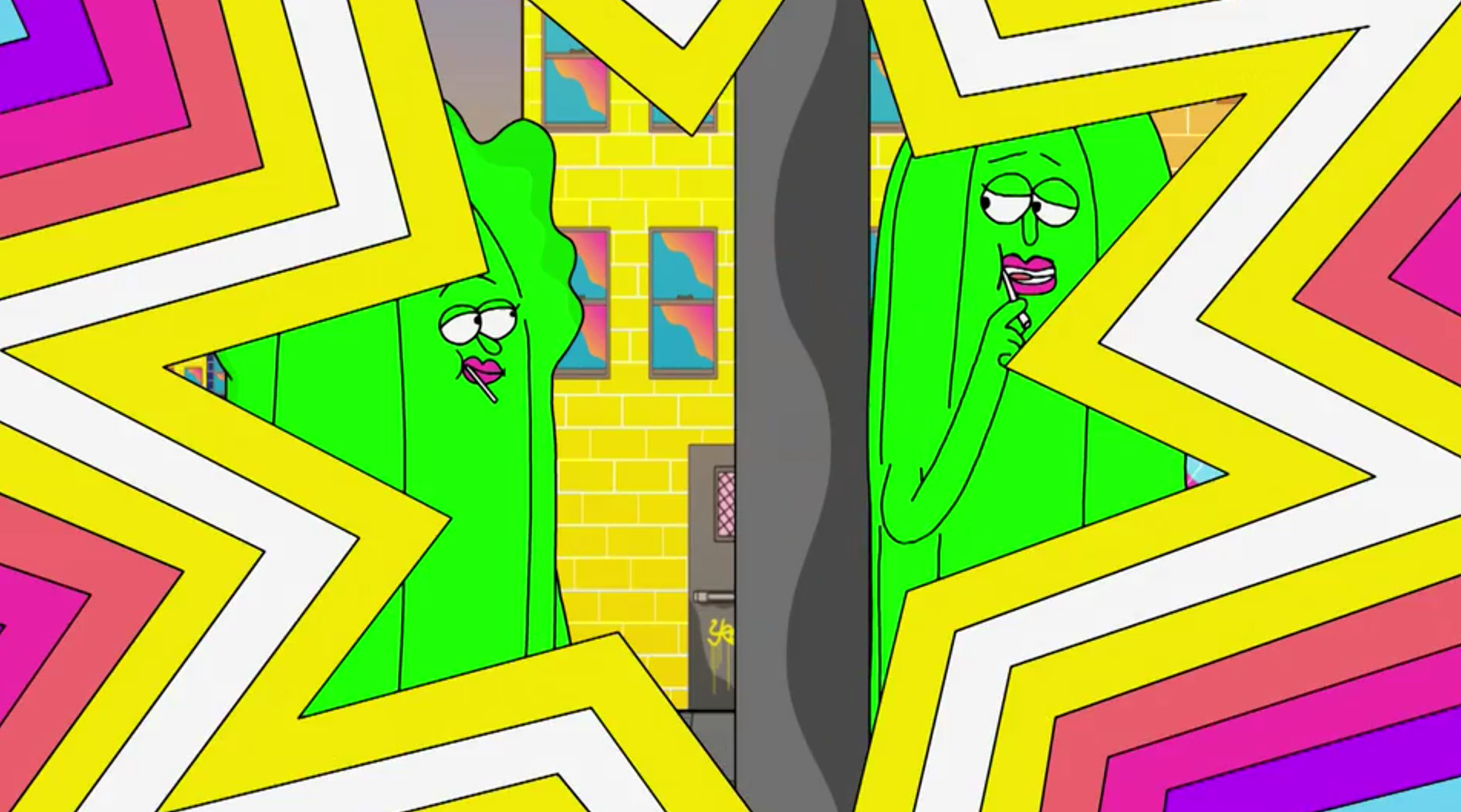
Stills from Dumpstar psychedelic sequence, (that will move in a poster) 2020, by Merlin Casey
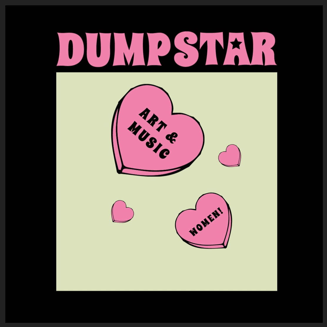
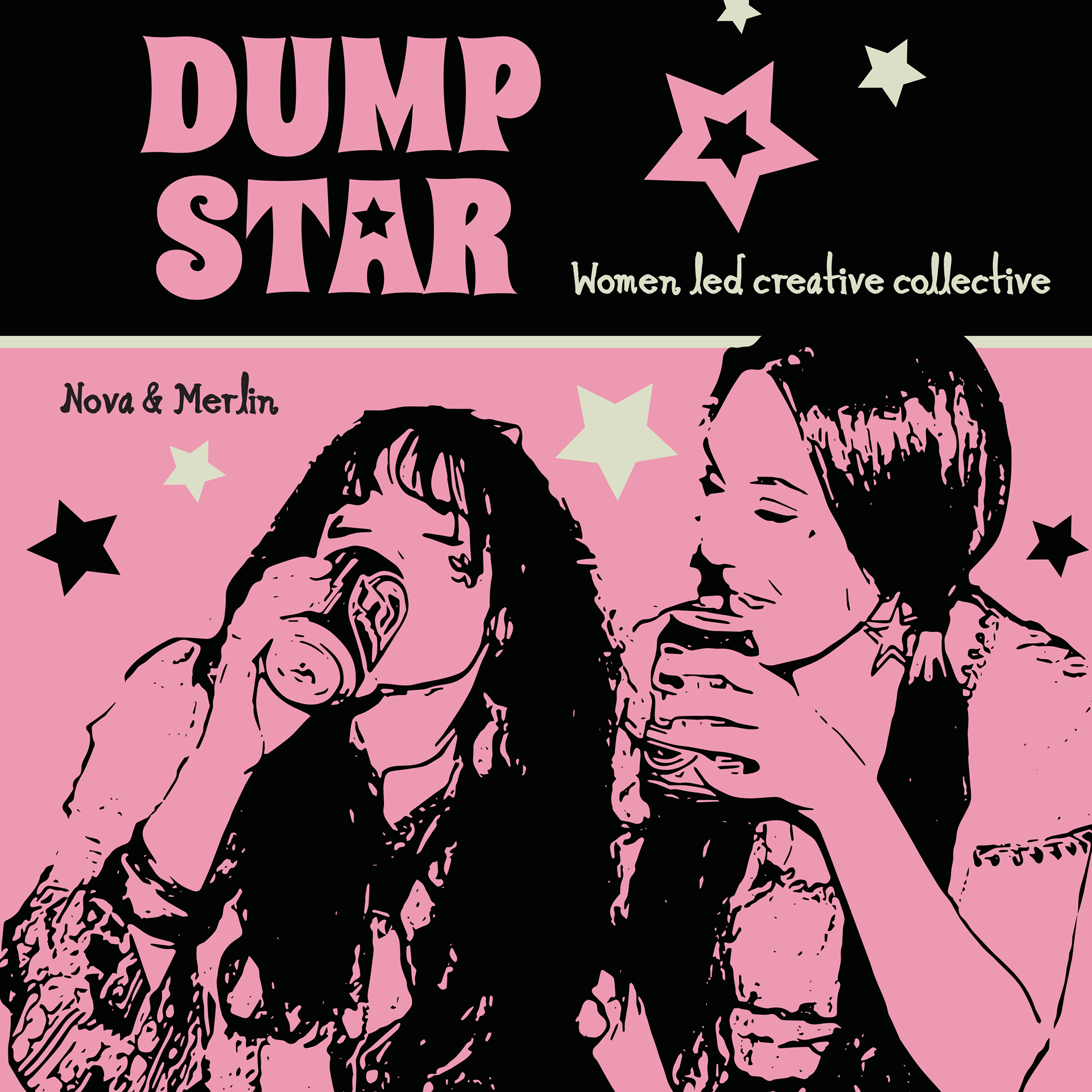
Dumpstar poster mockups, the first animates the candy hearts falling and text spinning and growing and retracting. the middle image is a flop, the vision was there but the execution is honestly just disturbing and weird.
I have been inspired by the opening title sequence for Mad Men (2007-2015) which is animated in flat colour drawings, line drawings, bold silhouettes and heavy typography. The retro sequence explains a lot about the storyline in 30 seconds with simple and effective modern retro motion graphics. Though this is not the approach I am taking it is a great example of simple block colour zooming and tracking of key elements such as the building or the final silhouette of Don Draper.
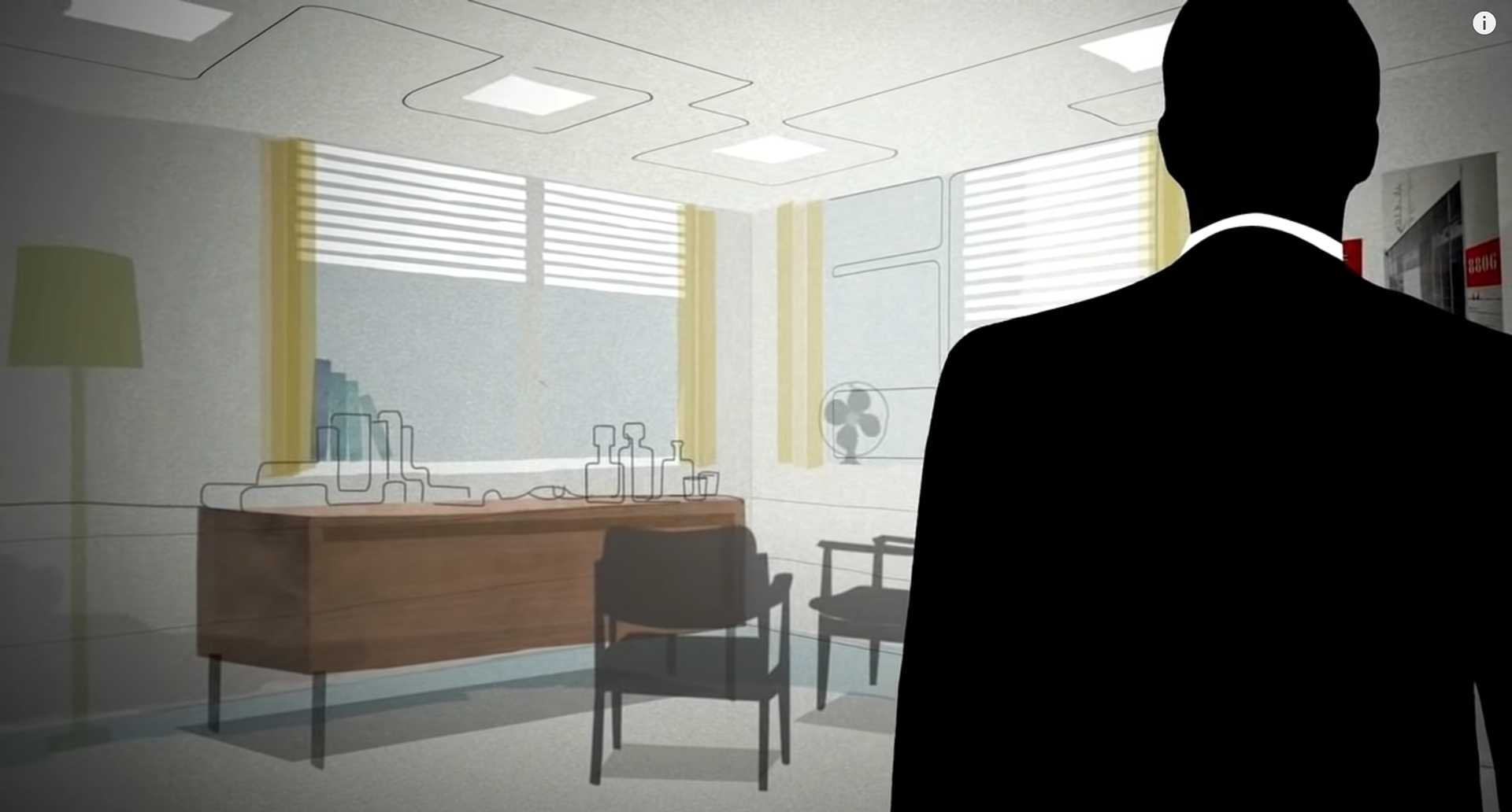
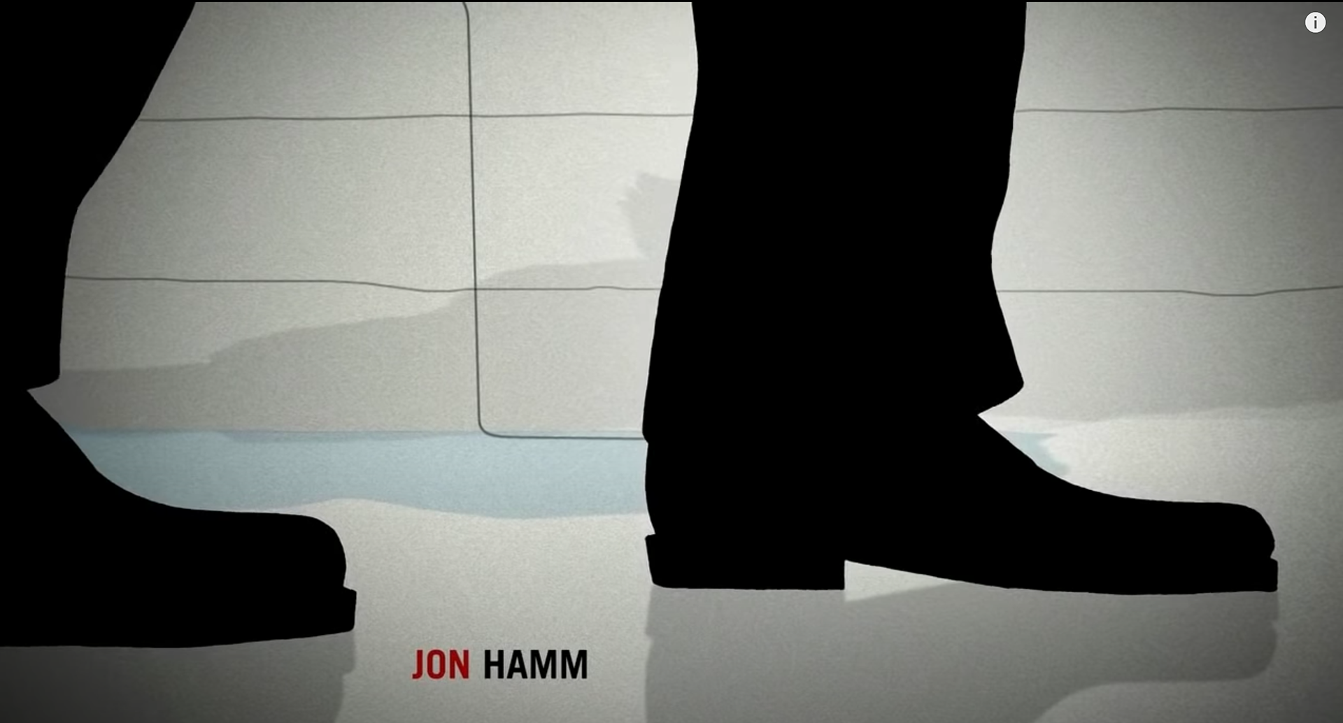
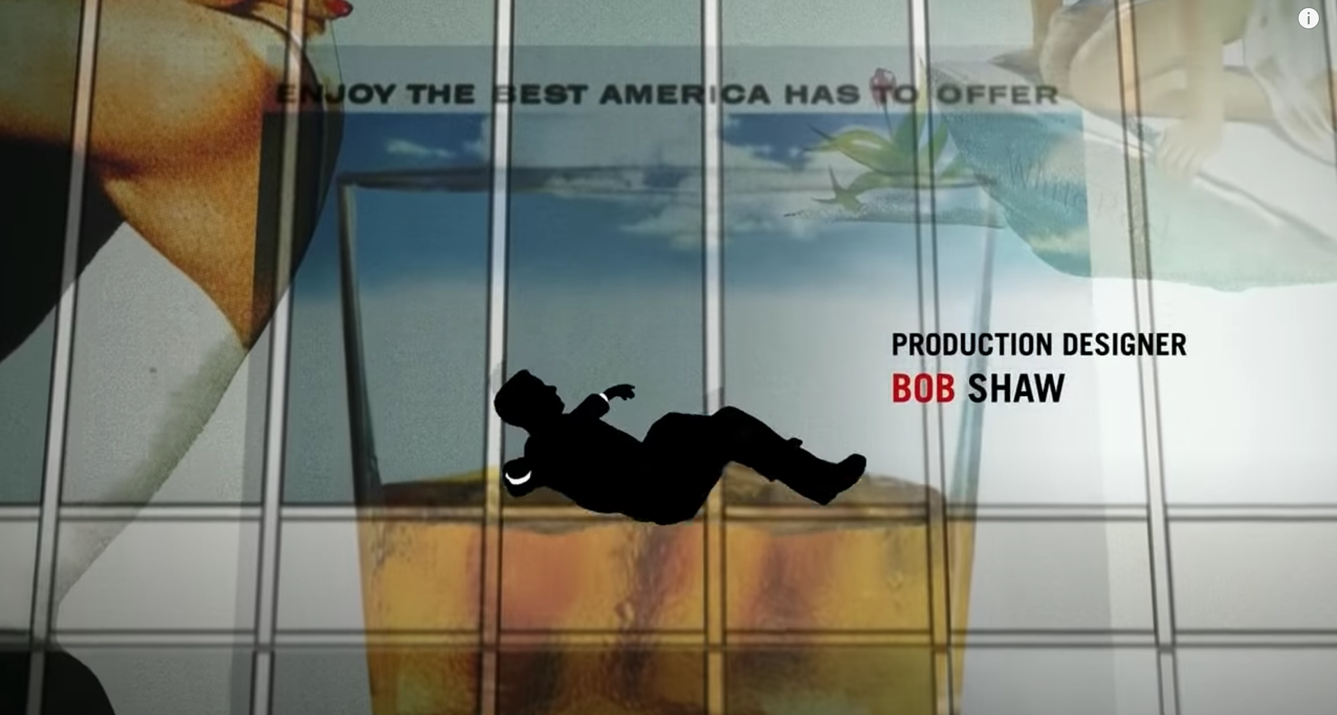
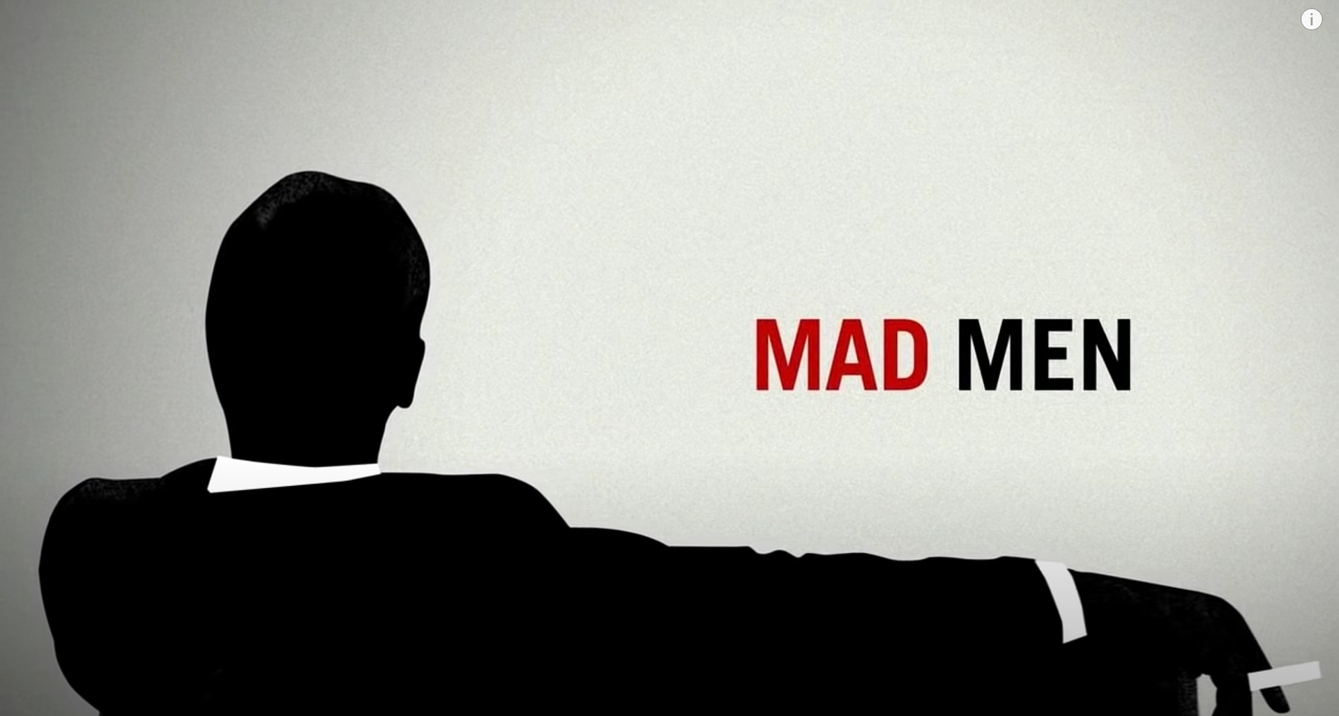
Stills from the Mad Men (2007-2015) title sequence
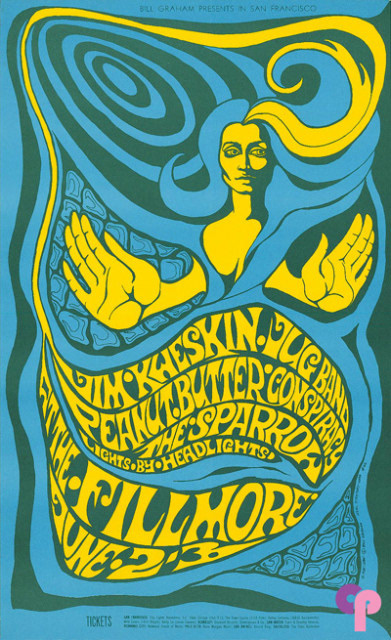
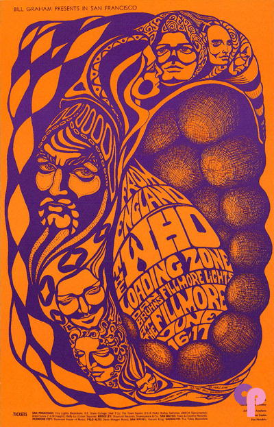
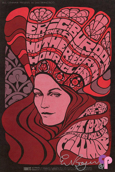
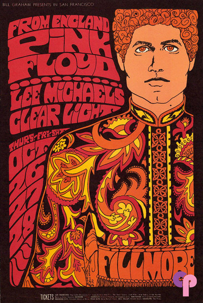
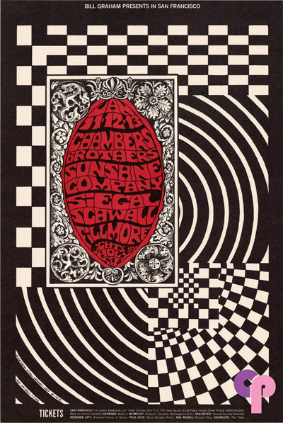
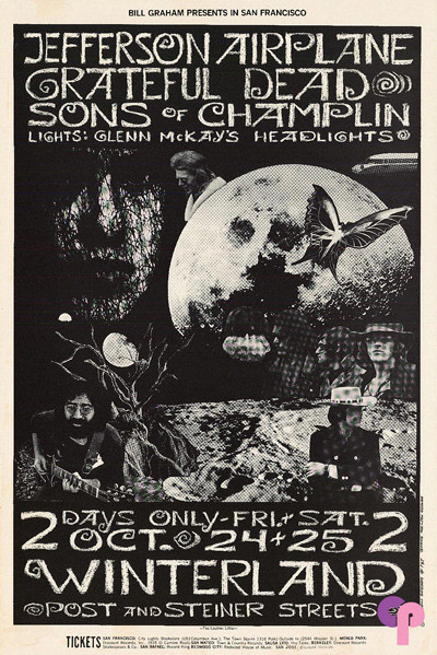
The incredible posters made by artist and design Bonnie Maclean in the 1960s are also always referenced pieces my major works. Her understanding of colour, mesmerising patterns and organic shaped women are very easy to imagine what they could look like animated.
Nova and I recently watched a new Netflix documentary called ‘Have a Good trip: Adventures In Psychedelics’ which has really great 2D animations and also insights about psychedelics, creativity and spirituality.
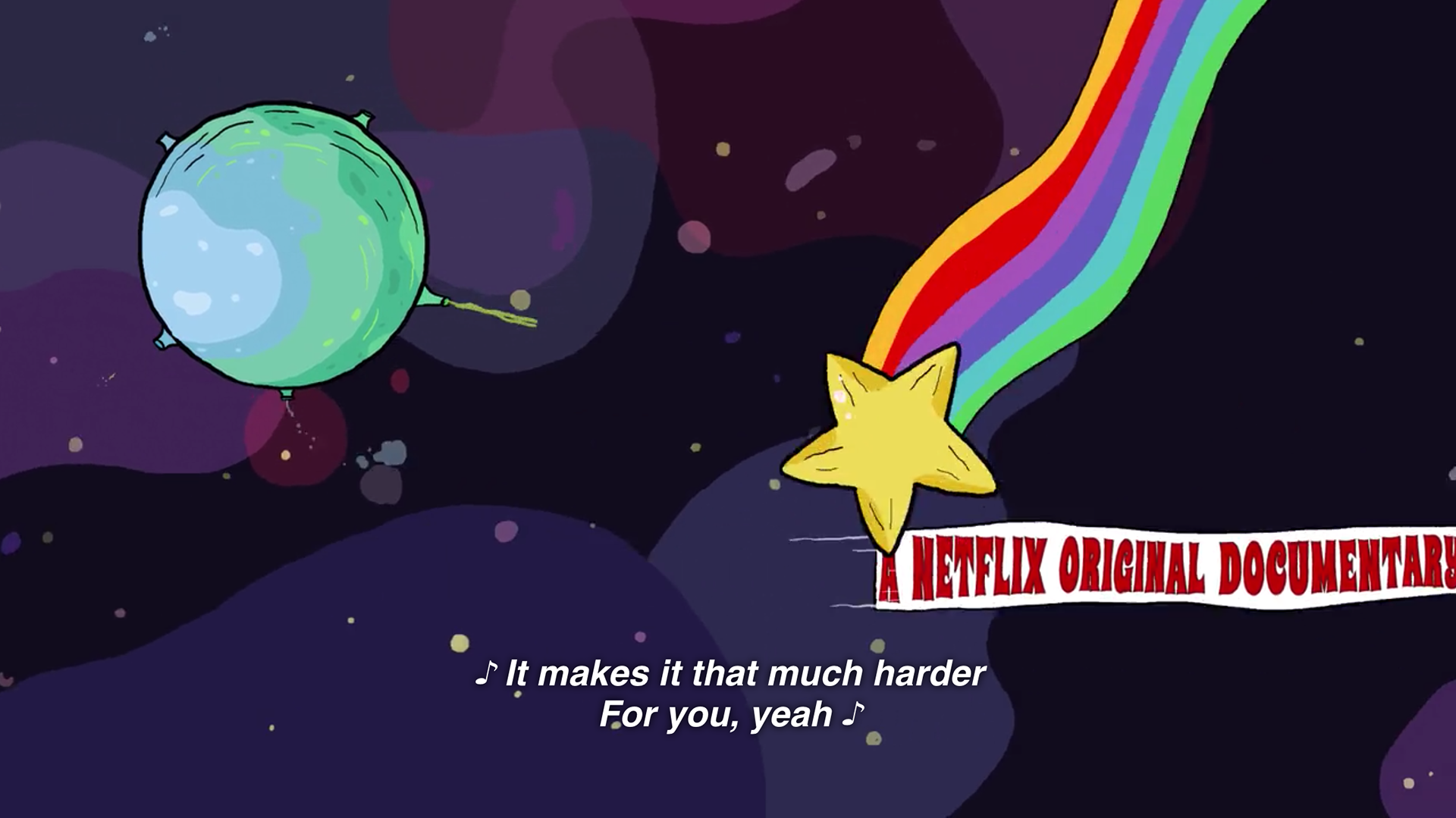
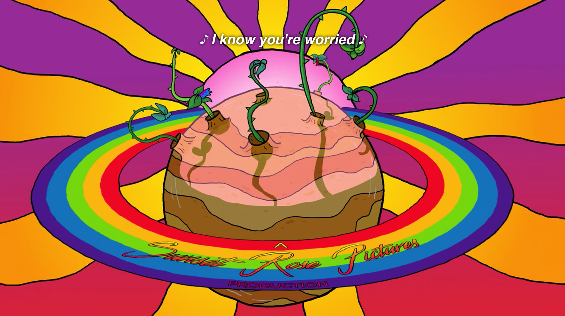
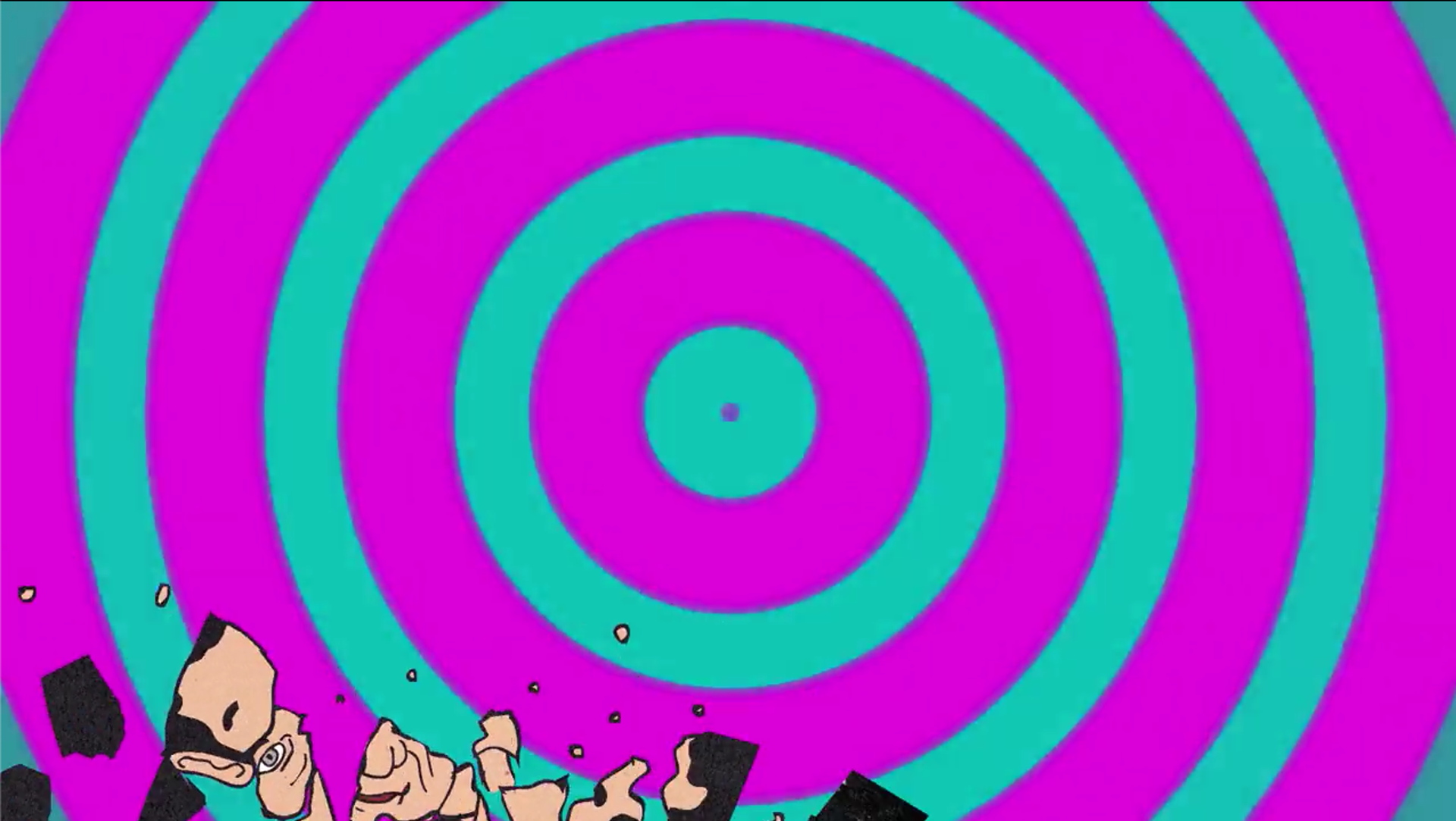
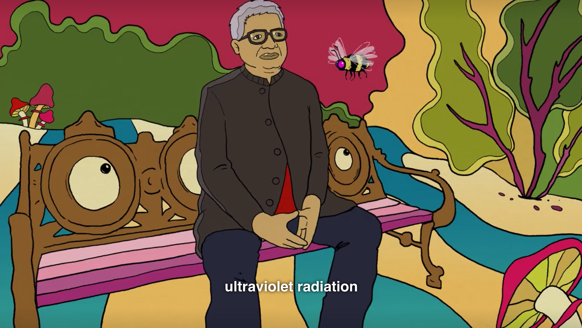
Stills from the Netflix documentary 'Have a Good trip: Adventures in Psychedelics' (2020)
Every episode of the TV show Broad City has a new animated title card. They are always incredibly entertaining, punchy and colourful and they have one episode about mushrooms in season 4 that incorporates animation and lie action through the whole thing. The simple patterned graphics seem pretty achievable and inspiring for a moving poster background.
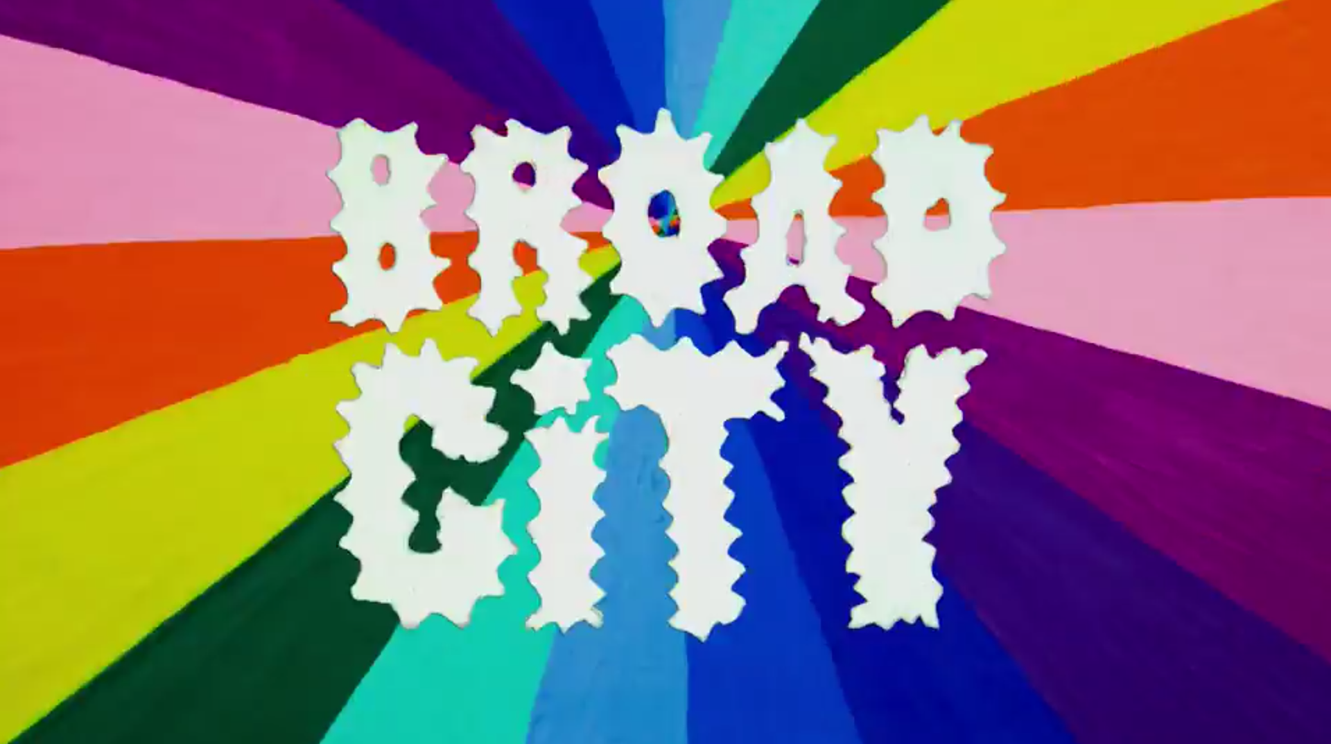
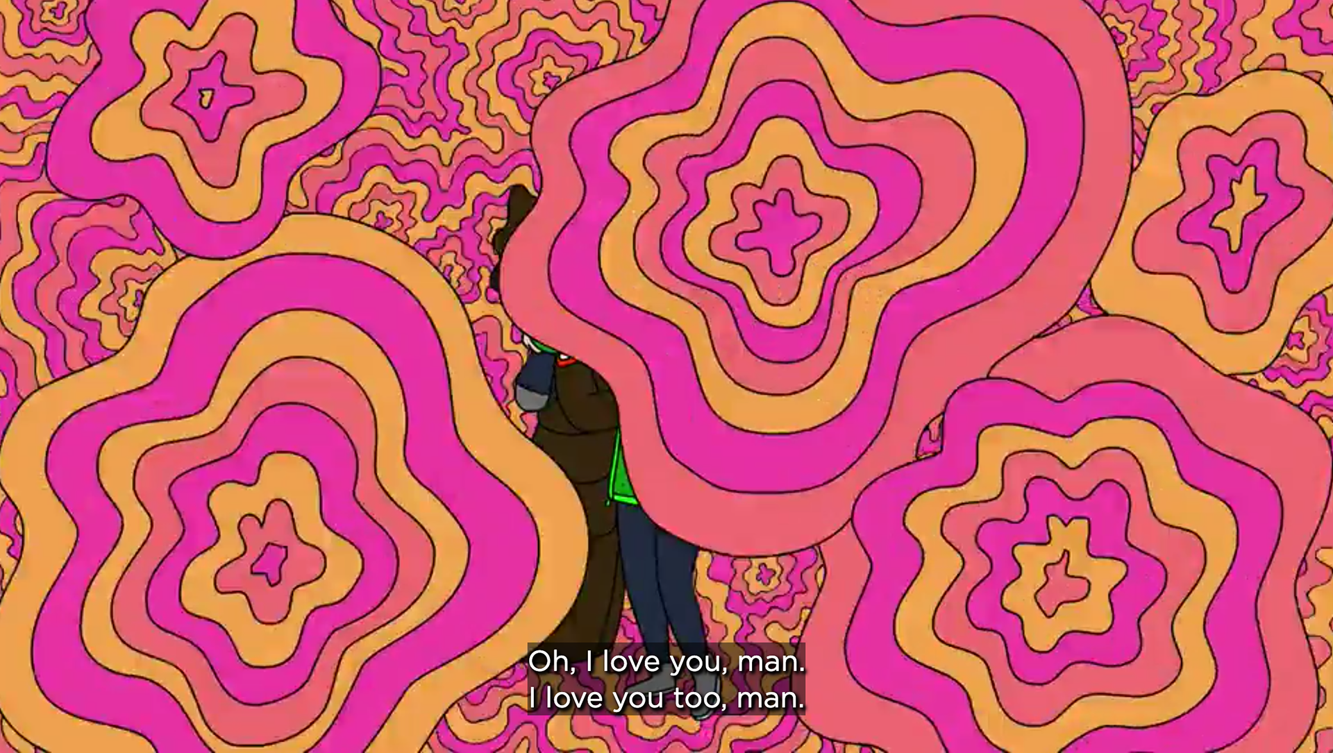
Stills from 'Broad City' s4:ep:4 'Mushrooms' (2014-2019)